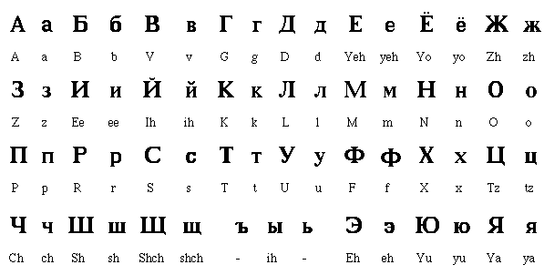
Russian


Australian


Jamaican
I began my research by looking at poster designs and images of the Jamaican icon, Bob Marley.

Stereotypically Jamaica is associated with rasta's and dreadlocks, this will be something I could consider when choosing a font. Also the style of font in this poster has a hand drawn and street art feel, this could also be another consideration.

This is a snippet from a book, the quotes by Bunny Lee is written how he would say it in a Jamaican accent showing how certain words and letters are stressed.

This is a sign post in Jamaica, again the type has a hand drawn feel and a textured element to it.

This is a speech bubble of geordie slang, it highlightes the way they say certain things and what letters are stressed in their accent.

This is a dialect translator poster which shows you the different words they use and how they are expressed.

This is a magazine all about the geordie accent, there is a complication of typefaces but they are generally bold and big.
I looked at a trailer from the TV series Geordie Shore, the advert displays the characters being party animals, loud, and glamorous, which will be features to consider when choosing a font.

I looked at a poster design that used typical scouse slang words and the type used to express them.
I looked at a trailer from the TV series Desperate Scouse Wives, the characters are very glamorous and always taking care of their appearance, displaying feminist traits in both the men and women. The accent also quite high pitched and generally pronounces certain words from the back of their throat.

I looked at the welsh alphabet and a lot of the words has extensions on the end of them like you would see in a serif design. It has a calved feel to the design and it very authentic.
The video explained that there was a gluide from high to low and that they have a 'sing - song' style of speaking.


I looked at the Captain Morgans alcohol advert and The pirates of the Carribean poster. the adverts displays a worn and ornate type. The generical style of pirate style type is very hand renderd.


The collection of typefaces in French generically used a san serif typeface with added swirls and bold ends. This types expressed that France is sophisticated and elegant, which is the attached stigma France has.
I began my research by focusing on the TV series, 'TOWIE'.


The accent it very elongated when it comes to pronouncing words and the type and style of the characters is very glamorous and sparkly.


I looked at the online Irish type design book, the words were very old fashion and similar to the welsh design of type. There is a significant use a lot of serif extentions.
Yorkshire

I looked at the popular bran Yorkshire Tea, to get an idea of the type. The type is quite bold and upfront but has a sense of nature and rurality due to the background.
I then looked at the Micheal Mactinyers stereotypical impression of a yorkshire accent.
No comments:
Post a Comment