POINT

A point is a unit of measurement that is the standard for measuring type and is used for measuring depth of printing. One point is equal to .013836 of an inch and 72 points are approximately 1 inch.
PICA
 A pica is a typesetting unit of measurement commonly used for measuring lines of type. One pica equals 12 points. There are 6 picas to an inch. -Source
PIXEL

Short for Picture Element, a pixel is a single point in a graphic image. Graphics monitors display pictures by dividing the display screen into thousands (or millions) of pixels, arranged in rows and columns. The pixels are so close together that they appear connected. -Source
Each pixel can only be one colour at a time. However, since they are so small, pixels often blend together to form various shades and blends of colours The number of colours each pixel can be is determined by the number of bits used to represent it.
For example, 8-bit colour allows for 2 to the 8th, or 256 colours to be displayed.
At this colour depth, you may be able to see "graininess," or spotted colours when one colour blends to another.
However, at 16, 24, and 32-bit colour depths, the colour blending is smooth and, unless you have some kind of extra-sensory vision capability, you should not see any graininess. -Source
Short for Picture Element, a pixel is a single point in a graphic image. Graphics monitors display pictures by dividing the display screen into thousands (or millions) of pixels, arranged in rows and columns. The pixels are so close together that they appear connected. -Source
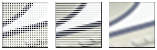
A pixel does not need to be rendered as a small square.This image shows
alternative ways of reconstructing an image from a set of pixel values,
using dots, lines, or smooth filtering.
Each pixel can only be one colour at a time. However, since they are so small, pixels often blend together to form various shades and blends of colours The number of colours each pixel can be is determined by the number of bits used to represent it.
For example, 8-bit colour allows for 2 to the 8th, or 256 colours to be displayed.
At this colour depth, you may be able to see "graininess," or spotted colours when one colour blends to another.
However, at 16, 24, and 32-bit colour depths, the colour blending is smooth and, unless you have some kind of extra-sensory vision capability, you should not see any graininess. -Source
GREEKING


The name is derived from the phrase ‘Greek to me’ .Greeking with respect to typography/design refers to the filler text which is used to bring out the real layout.
Greeking is used for two important reasons:
- When the real content is not available – layout creation and design can happen in parallel without waiting for the content.
- Real content might distract the viewer, while greeking/dummy text forces the users to concentrate on the design.
- Source

An example of my work with greeking.
I used the fill place holder with text option on InDesign.
LIGATURES

A ligature is a set of two or more characters that have been designed into a harmonious "set". Originally, they were designed to control letter spacing in situations where two or more letters take up too much space and have an uncomfortable feeling to the viewer. -Source
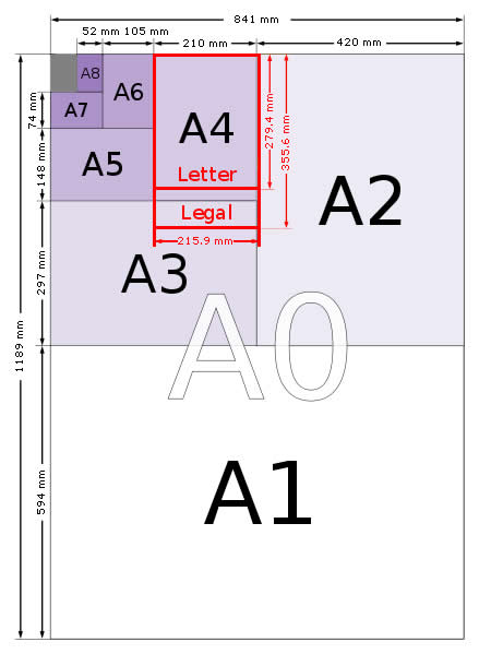
MEASURES
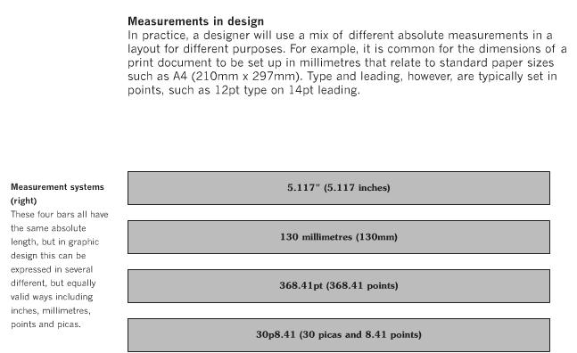
Measurement is an integral part of layout and design, from the spatial dimensions of the page,
to how the different text and picture elements are spaced. An understanding of various measurement concepts helps underpin and deepen knowledge
about layout design.
RULERS

Ruler guides are different from grids in that they can be positioned freely on a page or on a pasteboard. You can create two kinds of ruler guides: page guides, which appear only on the page on which you create them, or spread guides, which span all pages and the pasteboard of a multiple-page spread. You can drag any ruler guide to the pasteboard. A ruler guide is displayed or hidden with the layer on which it was created.

Guides in the document window
- A.
- Spread guide
- B.
- Page guide
- - Source
BOXES
Boxes are primarily used to display content in Indesign. The boxes can hold either text or images and are usually put into a design as an outline of where content can be presented.
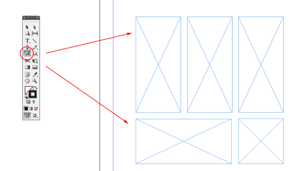

Boxes can come in different shapes depending on a designers preferance. To use then in Indesign you can either drag and drop then or edit them by using the 'text box' option.
Boxes are primarily used to display content in Indesign. The boxes can hold either text or images and are usually put into a design as an outline of where content can be presented.
Boxes can come in different shapes depending on a designers preferance. To use then in Indesign you can either drag and drop then or edit them by using the 'text box' option.
GOLDEN SECTION
The golden ratio has been used by many painters in the composition of their works as a means for locating key subject matter on focal points and of spacing the different elements of the composition.The golden ratio can be applied to any spatial relationship in the graphic arts, including design,such as object spacing, text and picture box location,pattern form and so on.

The golden ratio has been used by many painters in the composition of their works as a means for locating key subject matter on focal points and of spacing the different elements of the composition.The golden ratio can be applied to any spatial relationship in the graphic arts, including design,such as object spacing, text and picture box location,pattern form and so on.
DPS

Two facing pages of newspaper or magazine where the textual material on the left hand side continues across to the right hand side. Abbreviated to DPS.
DROP CAPS
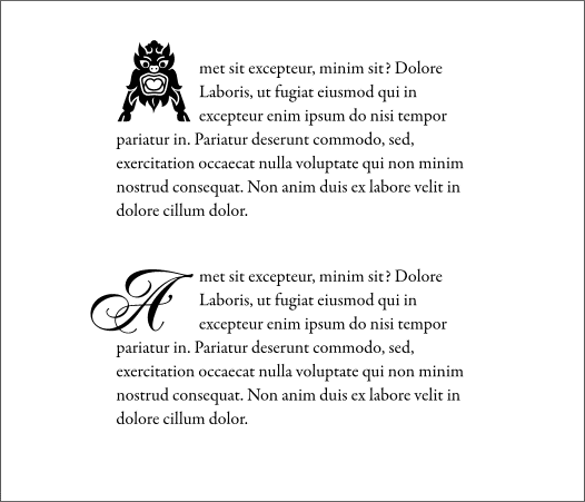
With a drop cap, the initial sits within the margins and runs several lines deep into the paragraph, indenting some normal-sized text in these lines. This keeps the left and top margins of the paragraph flush.
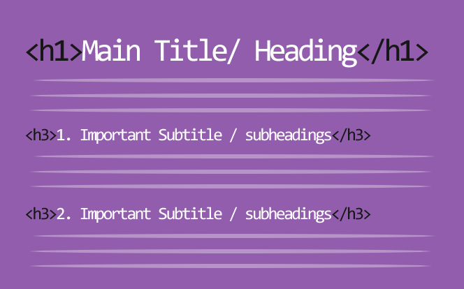
A subheading is a smaller version of a heading and it placed above a sub section of writing. It is also used as focal point in an article or layout and it's point size lies in between a heading and body copy size.


With a drop cap, the initial sits within the margins and runs several lines deep into the paragraph, indenting some normal-sized text in these lines. This keeps the left and top margins of the paragraph flush.
SUB HEADINGS
PARAGRAPHS
A paragraph is a self-contained unit of a discourse in writing dealing with a particular point or idea. A paragraph consists of one or more sentences.
FOLIO NUMBERS
In the discussion of manuscripts, a folio means a leaf with two pages, the recto being the first the reader encounters, and the verso the second. In Western books, read turning the pages over from right to left, when the book is begun with the open page edges at the reader's right, the first page to be seen is "folio 1 recto", typically abbreviated to "f1 r.". When this page is turned over "f1 v." is on the left and "f2 r." on the right of the "opening", or two pages that are visible.
For books in Arabic, Hebrew, Chinese and other languages, where the book is begun from the back in Western terms, with the open page edges at the reader's left, the numbering also follows the sequence in which the reader encounters. - Source
GUTTERS
The inside margins or blank space between two facing pages is the gutter. The gutter space is that extra space allowance used to accommodate the binding in books and magazines. The amount of gutter needed varies depending on the binding method.
In saddled-stitched publications the amount of gutter, as well as the outside margins are adjusted to allow for creep. Gutter is sometimes used to refer to the alley or space between columns of text in a page layout. - Source
IMAGES
An image is either a photography - icon that supports the text or title in a layout design.
I looked at two images on of a mock up design and a finished design with an image to show how they work in a layout.
HEADLINES
A heading at the top of an article or page in a newspaper or magazine, they are used as focal points to attract the reader.
Headlines generically used a bold san serif font for optimum legibility and readability. They are also generally at a point size of 72 or above.
PAGINATION
Pagination is the process of dividing content into pages.
Printed books and magazines are created first as electronic files (for example, PDF or QXD files) and then printed. Pagination encompasses rules and algorithms for deciding where page breaks will fall, which depends on semantic or cultural senses.
Before the rise of information technology (IT), pagination was a manual process, and print output was its sole purpose. Every instance of a pagination decision was made by a human. Today, most instances are made by machines, although humans often override particular decisions. As years go by, software developers continually refine the programs to increase the quality of the machine-made decisions so that the need for manual overrides becomes ever rarer. -Source
CAPTIONS

Captions are small explanations under and image to tell the reader what it is about. Captions are generally set a small point size and sometimes can be layered on top of the image depending on the layout.
IMPOSITIONS


Imposition is one of the fundamental steps in the prepress printing process. It consists in the arrangement of the printed product’s pages on the printer’s sheet, in order to obtain faster printing, simplify binding and reduce paper waste. - Source
Captions are small explanations under and image to tell the reader what it is about. Captions are generally set a small point size and sometimes can be layered on top of the image depending on the layout.
IMPOSITIONS
In the example above, a 16-page book is prepared for printing. There are eight pages on the front of the sheet, and the corresponding eight pages on the back. After printing, the paper is folded in half vertically (page two falls against page three). Then it is folded again horizontally (page four meets page five). A third fold completes this process (page nine meets page eight). The example below shows the final result prior to binding and trimming.
Imposition is one of the fundamental steps in the prepress printing process. It consists in the arrangement of the printed product’s pages on the printer’s sheet, in order to obtain faster printing, simplify binding and reduce paper waste. - Source


