For my exhibition I wanted to create programmes that could be used in the space and also to detail the audience further on what the event is about. I decided to go for the format of a newspaper as it is a form of mass media which links in with what I am talking about in my dissertation.
I decided to research into newspaper printers and found the newspaper club, and ordered some samples so I could consider the format I would like to design digitally.

The newspapers came in a multitue of sizes and prices, out of all the designs I felt the digital broad sheet was the most appropriate and fitted into the price range for the exhibition costing £8-14, per copy.


The digital tabloid fitting into the theme of mass media and also the size of the newspaper would be good for the display of artwork at a bigger scale.
Design
Due to the christmas holidays I had only a 2 days to produce my magazine due to the newspaper club opening times so I had to make fast and critical design decisions for this process.
I decided to simply detail what each section was about, with references from my dissertation to back up what I was trying to present in the exhibition and previews of the artwork. Using a template from the website.
Front

With the promotional posters using this image and it being the main presence in my promotional material I felt that this would be the best cover for my publication. I simply added the exhibition programme details using the main font Apercu that runs throughout the branding of my work.
Introduction


With the newspaper being folded into four sections I fixed a grid and applied the information and type within this format experimenting with colour and content. The final image was the design I decided to stick to as it's clean and concise and the writing will not be compromised by the format.
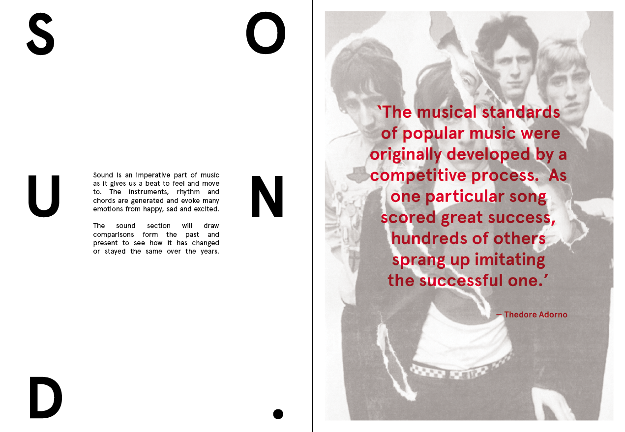


For the sound page I kept to the same grid experimenting with content and images to create the most appealing layout. I chose The Who art work and cropped it slightly as I only wanted to give small previews of the artwork.


I again followed the same process for the lyrics and vision section to maintain consistency.
Top 10 artists who are sampled


With the publication being 12 pages I decided to add some extra information that I collated in my research that I couldnt apply to my artwork to give the audience a further insight into the subject. I decided to list the top 10 artists sampled with images and facts.
Back


For the back I decided to just use a simple R from the logo, to add colour to the design and would look more appealing.
With the design being a quick turn about brief I didn't have much time for further development, however I am really pleased with the outcome and think the programme is and original idea and is visually striking. I really enjoyed work with another type of printed publication and I am excited to see the final product.
Digital Version
No comments:
Post a Comment