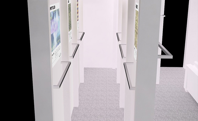
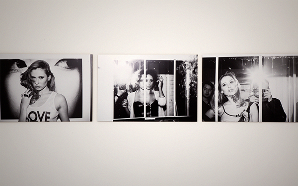
I’m Glad We’re Different
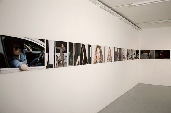
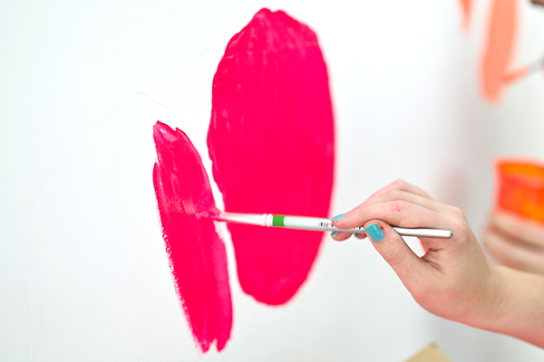
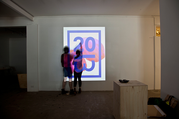
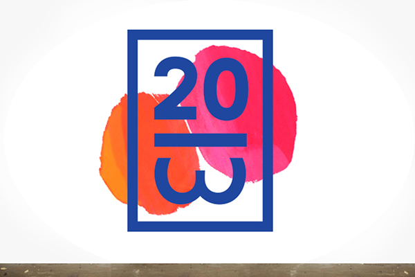
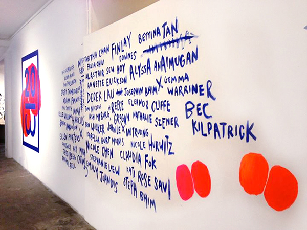
brings together Beatrice, Izziyana, Pete & YT, four local artists who come from different backgrounds and disciplines. Collectively, they explore the meaning of individuality and self, and the result is a delightful smorgasbord of art works done in differing mediums, each close to their creator’s heart and opinion on the theme.
-
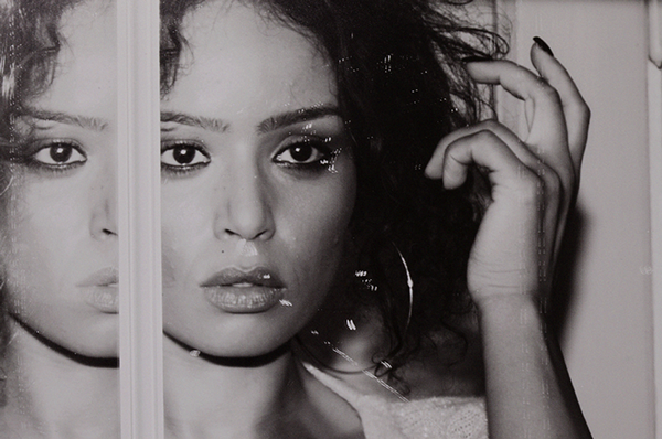
Work: Branding & Exhibiting Artist


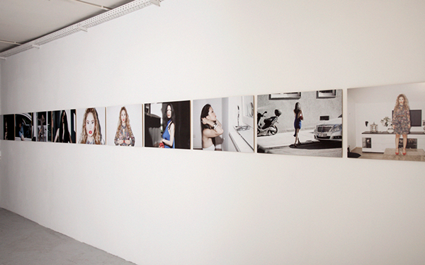
brings together Beatrice, Izziyana, Pete & YT, four local artists who come from different backgrounds and disciplines. Collectively, they explore the meaning of individuality and self, and the result is a delightful smorgasbord of art works done in differing mediums, each close to their creator’s heart and opinion on the theme.
-
Work: Branding & Exhibiting Artist
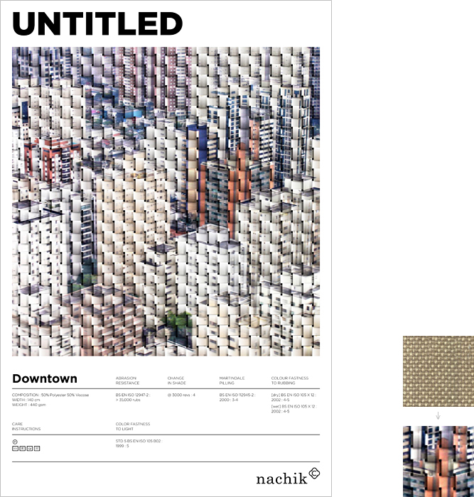
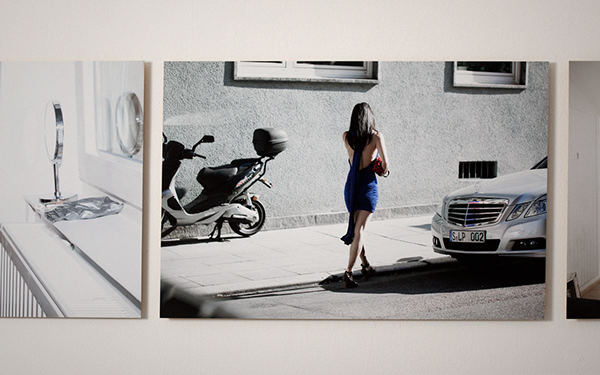
Nachik | Mood Exhibition 2013
Exhibition branding and design for 'Nachik Ltd', a local fabric manufacturer. Every year he presents a new collection of fabrics, whereas his current collection was inspired by works of art. The design project included interpreting each fabric from the collection and turning them into graphic patterns. This collection was presented in several fabric exhibitions throughout Europe.
This project was made in the course of my work at Alon Deri Studio 'Roof'.


This project was made in the course of my work at Alon Deri Studio 'Roof'.
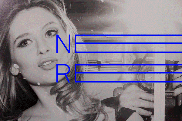
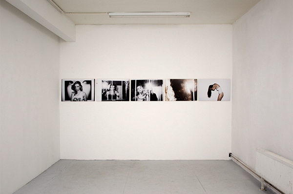
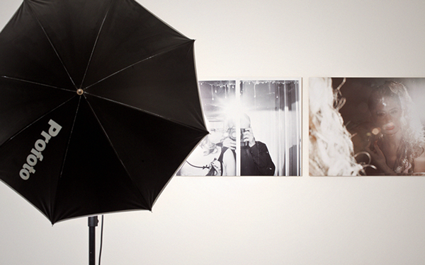
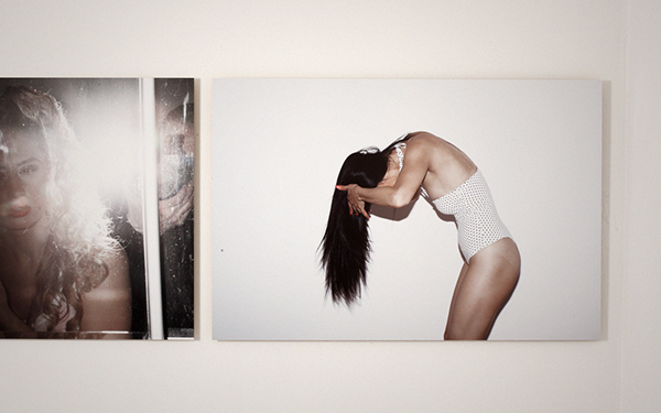
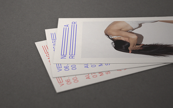
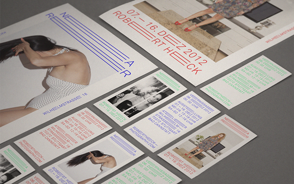
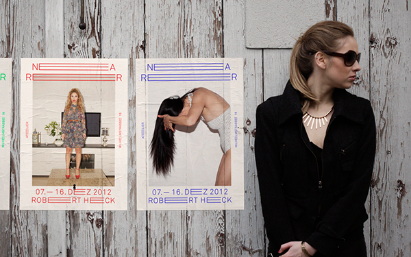
Conceptual exhibition and installation of the self initiated project "nearer".


No comments:
Post a Comment