From looking into the branding of the Parklife festival, the 2013 / 2014 designs are something I am more interesting in aesthetically. However I decided to still research into the print and merchandise the festivals has used over its 4 year duration to get a sense of how the brand has moved forward and developed.
2010
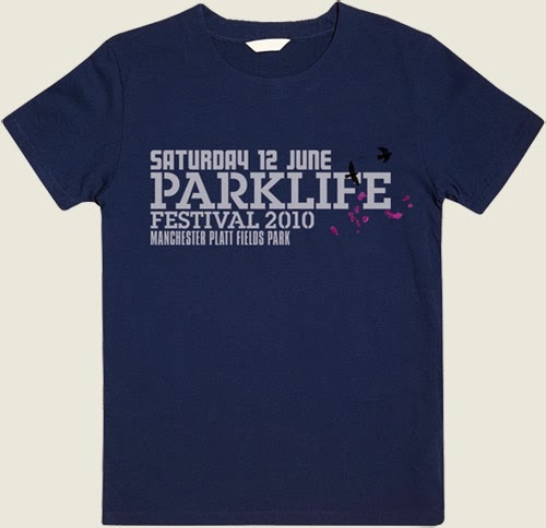
The 2010 designs have a real sense of youthfulness due to the collage of images of the artists. I like the use of black bold text and images with a hint of colour to make the designs stand out. The colour scheme uses dark and light blues to possibly represent the manchester weather.
2011
The 2011 designs follow on from the 2010 designs but use more colour and imagery to appeal to it's target audience. The collage of artists make it look as though the artists are all partying together at the festival and create a bold and fun atmosphere. The 2011 design uses more yellows and reds to represent the time of year that the festival will take place (summer) which is more fitting to the season of the festival.
flyer.
programme / event times
after party flyer
t.shirt design
2012
The 2012 designs completely break away from the previous designs in 2010 / 2011. The branding takes on an even more brighter approach with the use of bright colours in the logo and geometric patterns which fits in with the electronic music that is displayed in the event. The imagery also takes on a more realistic approach with polaroid shots of the artists that create a more personal approach. The imagery also creates a sense of nostalgia through it's old school style filters. The filters they use are warm which also goes hand in hand with the summer time of the festival and creates a sense of excitement and happiness.
flyer.
double sided flyer
programme
billboard
lanyard programme
imagery
poster
website
2013
The 2013 design then progressed further into a more hand rendered style. I think this design works really well as the aesthetic explicitly fits in with the target audience of students. The colours are again vibrant and warm to represent the time of the year. The 2013 design has also been used again for the 2014 festival.
website
The branding of the festival also creates synergy through it's merchandise. The iconic logo, transcends through the festivals clothing, bags, fans, lanyards and wristbands to create a strong brand image for it's consumers to recognise and connect with. The apparel ranges from £3 - £16 which is reasonably considering it's target market which is generally students.
The Parklife festival has extensively developed through it's aesthetics over the past 4 years, however the branding of the festival has also had a handrenred and vibrant feel which makes the festival look personal and welcomming. The merchandise and printed paraphernalia ranges from posters, billboards, clothing and wrists bands and has overall created a strong visual look.


No comments:
Post a Comment