Range:
Yay Festival.

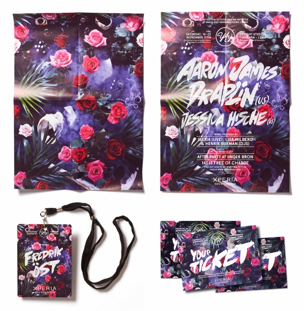


The range for the Yay festival music event is extensive in considering both print and digital platforms. As discussed in my initial research into the importance of of creating a strong identity for consumers to relate to, I think this has been done successfully there with the use of colour pallet and font.
Northside


Northside's range takes more of a digital focus looking at website design and app designs for the event. This might due to the type of audience that festival is aimed at and the style of music. The simple colour pallet is maintained throughout the type, image and layout of the festival and makes the overall aesthetic cohesive and easy to identify.
Fringe
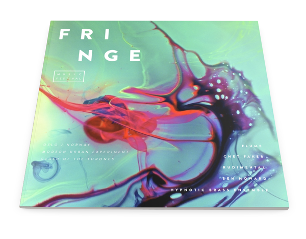


From this research I found it really interesting in looking at how a brands identity can be extended into a range of products and digital media to expand the brand. They designs again work together across a multitude of platforms and are relevant to the musical context.
No comments:
Post a Comment