For my publication I began reviewing online material to see how the content was visually laid out. I specifically focused on the content for my 10 things as a source of influence.
10. CONVEYING A MESSAGE
I started my research by looking into how different tones of voice can be portrayed.


The two examples of a phrase give off a different tone of voice due to the design. The first one has a serious feel to it due to the black and white colours. In comparison the other design it very playful and light hearted due to the multiple typefaces and colour.
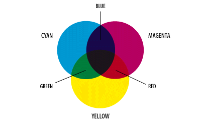
9. BASIC COLOUR THEORY
I looked at poster designs and images of how basic colour theory was portrayed.

Source
This chart shows all the terminology in a simplistic and cohesive way. I would like to incorporate this style of design in my publication.
8. GRIDS, COLUMNS + MARGINS
The three terms are all relevant to one another, so I wanted to find designs that used these all together in a clear way.


7. SEMEIOTICS
To begin my research I looked at the fundamentals of graphic design e-book.


The layout and content of the book was very straight to point with simple illustrations, which makes it easy to understand.


Source
I then looked at another online book on Behance which explained semiotics through simplistic pictures and short explanations, this design would work well for my publication as I wanted to keep it informative but straight to the point.
6. TYPE VS. FONT
I revisited some old study task's I had done to see how I explained the difference.
I revisited some old study task's I had done to see how I explained the difference.

A typeface is a particular design of type. Arial rounded is a typeface
A collection of characters, letters, numbers, symbols, punctuation, which have the same distinct design.

A font is a complete character set of a single style of particular typeface. -e.f arial rounded italic and bold.
I would like to keep it simple like I did in one of my post's but express the meanings by using different fonts from the same typeface.
5. LEGIBILITY AND READABILITY


I sourced some images that manipulated type to convey the meaning of the words. I like how it's very simple but again illustrates the meaning.
4. RGB + CMYK
To begin my research I looked at different types of images of how they displayed the colour modes.


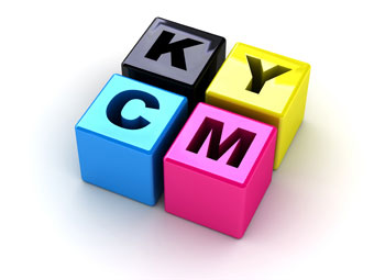
I really liked the style of colour blocks or circles as these geometric patterns are generally associated with colour and colour theory.
3. PAGE SIZES
I also looked a different ways pages sizes were displayed and scaled.
I also looked a different ways pages sizes were displayed and scaled.

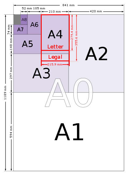

I really liked the second image as it was something I was familiar with myself and felt it was clear and concise, due to it being vertical.
2. DIVINE PROPORTIONS / GOLDEN SECTION


The step by step examples that are accompanied by instructions is simplistic and easy to follow.

Source

Source
This is a stylistic way of portraying the golden rectangle which looks aesthetically pleasing and modern.
1. PERSONALITY
Graphic design isn't just about you as a designer but you as a person. Your background and life experiences are what makes you an individual. I took a quote from a lecture I attended and want to use this as the closing statement in my book.
"Design is not your job. Design is about people, your personality and the ability to make relationships work is a massive factor in your employability" - Craig Oldham
I then revisited some publication designs that Phil presented to us in a lecture.
No. Zine


source: no zine
Neasden Control Center


Source


Source


Newwork Magazine
Source
I then started to research magazines that followed a similar style of no.magazine. With designs that experimented with type and layout innovatively.
MAP magazine
The use of two colours against white stock really makes the letters stand out and offers significant focal points to the page which is something I would like to incorporate.
Toko Nu
There is an innovative use of type spacing and shapes, although it isn't a traditional style of
design it is still legibile.
Spook Magazine
The layout uses a post-modern style by using different fonts, weights and columns. Although the design is not symmetric the design still works due to the use of negative space.
Plastique Magazine - Web
The use of type and then image of juxtaposing pages allows the audience to focus of the double page spread as a whole. I also like the experimentation with woodblock print on the pages.
I really like how Plastique magazine uses a lot of negative space in their design and shapes. This will be something I will consider when mocking up my layout design.
No comments:
Post a Comment