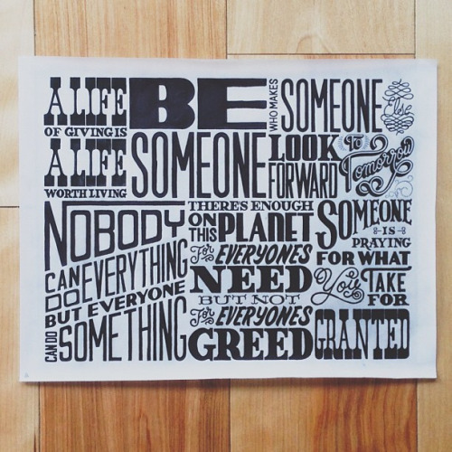
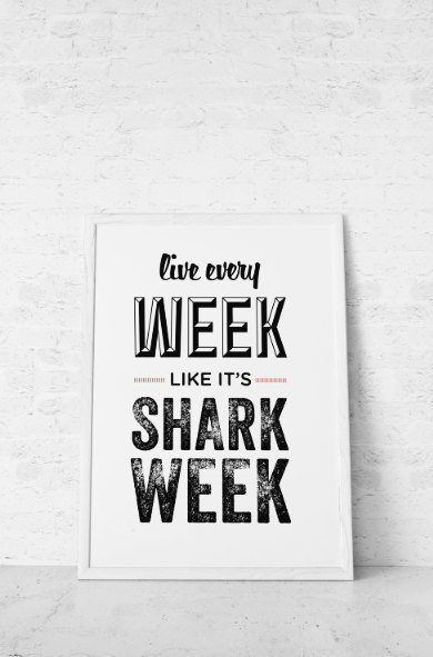
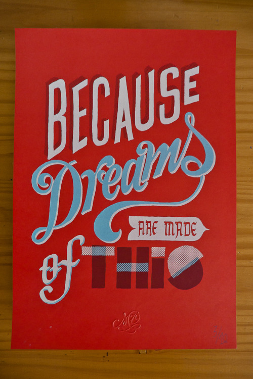
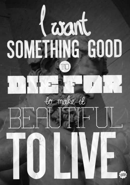
I began to research different designs that worked with juxtaposing type to help influence the design direction.


Source: Behance
Source: Betype

Source: Pinterest

Source: Pinterest

Source: Pinteres
Source: Betype
Source: Betype
Source: Betype
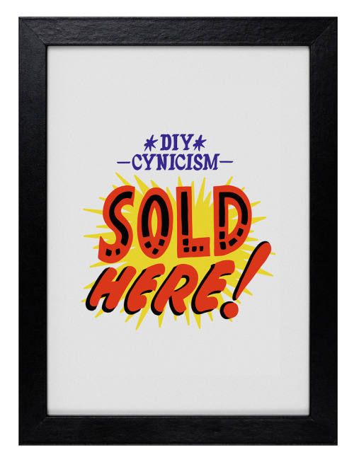
Source: Betype
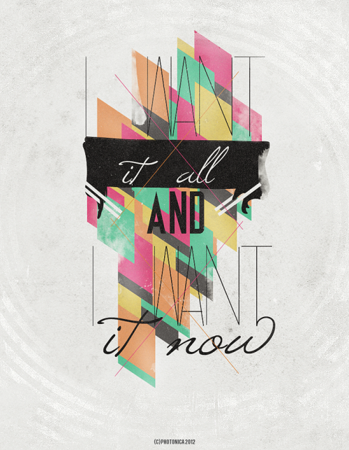
Source: Betype
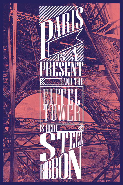
Source: Betype
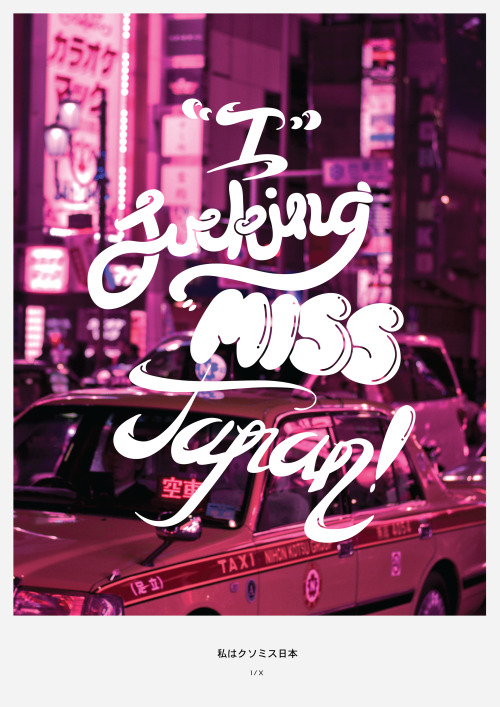
Source: Betype
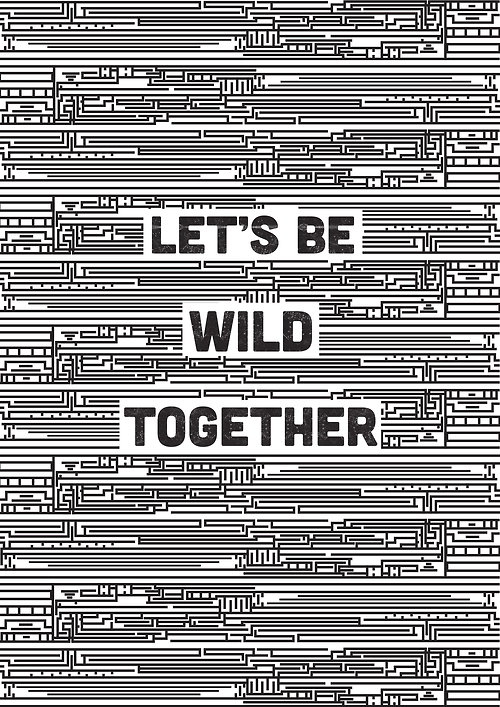
I also looked at type with geometric style backgrounds, as this was a design idea we wanted to incorporate.
Source: Designersof

Source: LovelyJoJo's
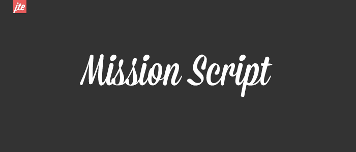
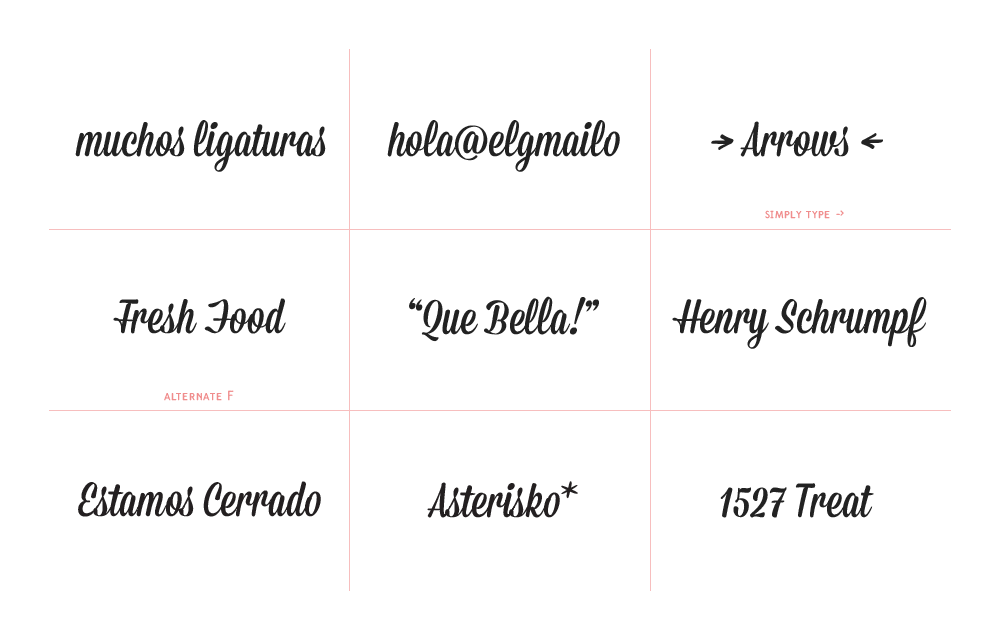
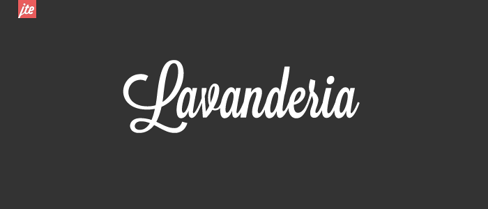
I then looked at different typefaces that we could incorporate.
- Script
Source: LostType
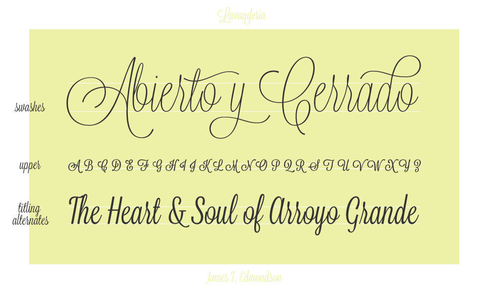
Source: LostType
- Gothic
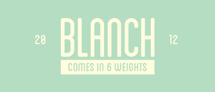
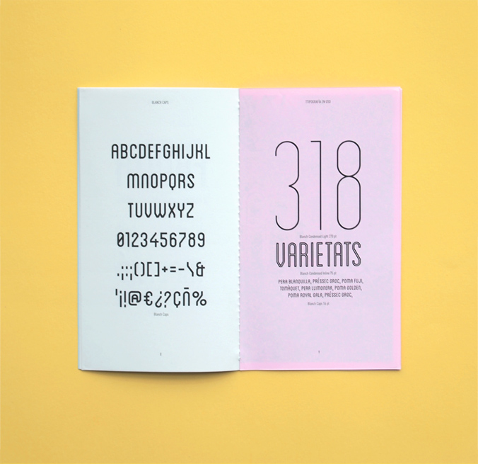
Source: LostType
- Roman

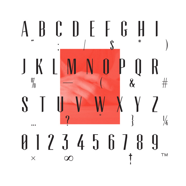
Source: LostType
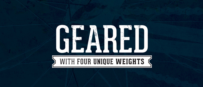
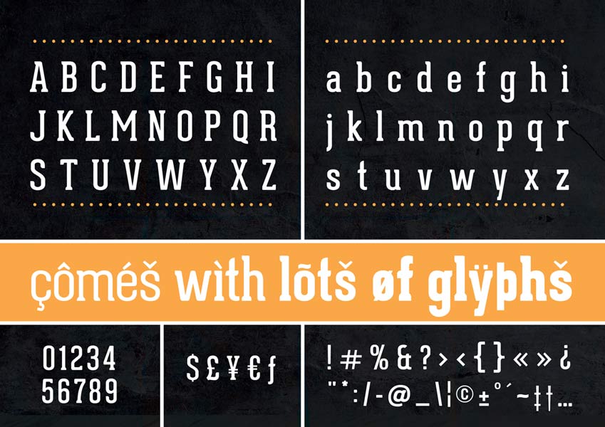
Source: Lost Type
- Bold
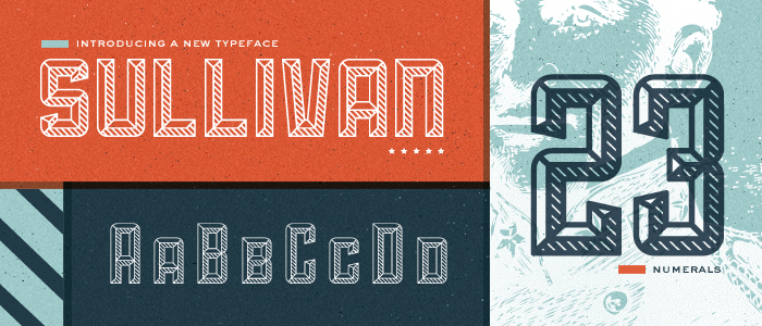
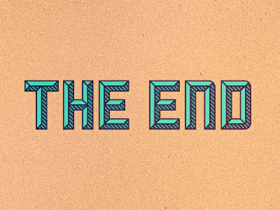
Source: LostType
Source: LostType


- MANIFESTO
I started my research by looking a manifesto's that already excisted in poster form and digitally by artist's.
There is end result and before that there is process, but which is more interesting? Venice-based graphic designers Tank Boys, and writer Cosimo Bizzarri, would argue the latter (as perhaps we all should), and so have set up Manifesto., “an ongoing project that leaves the final result to one side so as to focus on the creative process.” Beginning life as a travelling exhibition, and next as a book, the project continues to provoke debate as a manifesto-packed website. We talked to the curators to find out more…
- PACKAGING

We settled a few design idea's but then our concept changed after the crit. We decided to expand our project into a motivational pack, which included a blog, tshirt and badge designs. My role in the group was to create these.
Our blog layout ideas -
modernise us designs
I started to research text based t.shirt designs that could influence the direction of design. I focused on designs that used multiple typefaces or experimented with them as our design theme was like this.

Source: Design Inpiration

Source: Design Inspiration

Source: Design Inspiration

Source: Design Inspiration

Source: Design Inspiration

Source: Design Inspiration

Source: Design Inspiration

Source: Design Inspiration

Source: Design Inspiration
After looking at few designs I thought about production and time, I then started to look further into screenprint based designs.


Source: Soft City
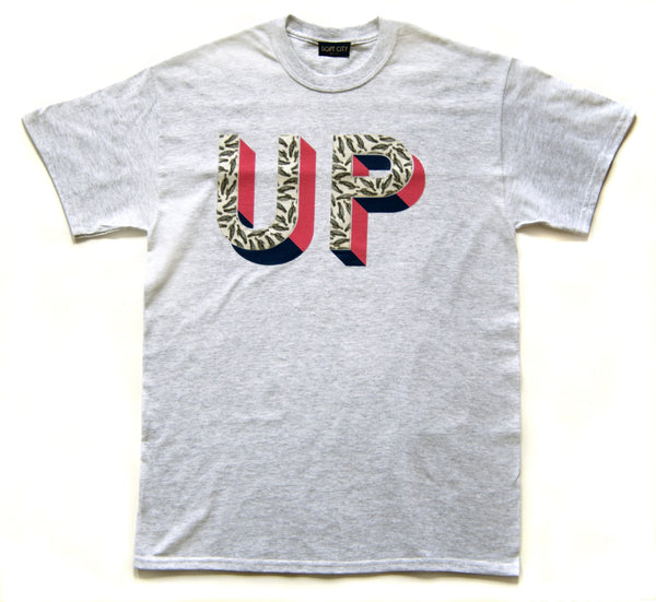
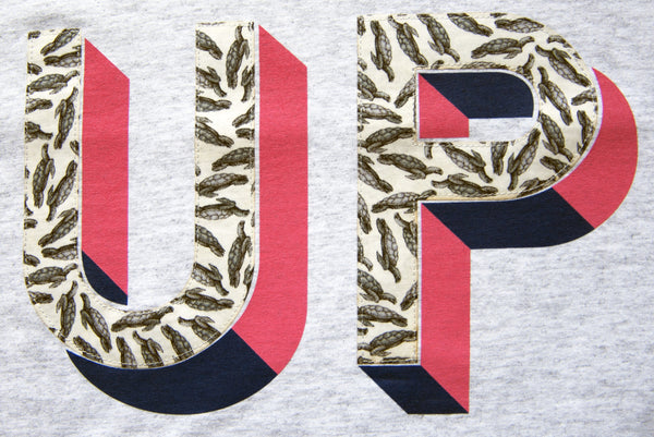
The UP t-shirt is made up of a pink and navy blue screenprint letter shadow and a vintage Liberty's turtle print with light grey stitching around the edge of the letters.


Source: Soft City
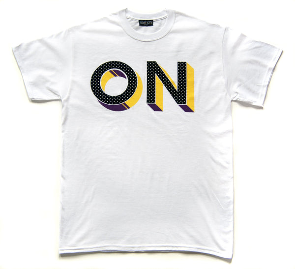
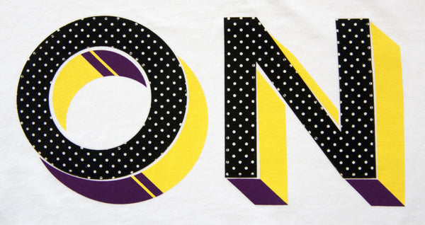
The ON t-shirt is made up of a purple and yellow screenprinted letter shadow and individually stitched letters made from cotton black and white polka dot pattern with black stitching around the letters
- MANIFESTO
I started my research by looking a manifesto's that already excisted in poster form and digitally by artist's.
Guys, could you first introduce us to Manifesto.? What is it exactly?
Manifesto. is an on-going project about design manifestos. It started as an exhibition that was displayed at XYZ Gallery (Treviso, Italy) and then at Shandong University of Art and Design (Jinan, China). Then it became a book and a website. It might turn into something else in the future. It collects the personal and professional beliefs of some of the smartest contemporary designers: Bruce Mau, Stefan Sagmeister, Milton Glaser, Bob Gill, to mention just a few. Some of the manifestos are programmatic pieces of writing, others are detailed work manuals, all are passionate tributes to graphic design, creativity and the design culture. A lot of words and ideas, basically.
What do you hope to achieve with the project?
Back when we started in 2009 our goal was to take some time to ruminate on how people design. The idea was that of keeping the final result in the background and focus on the working process. We thought that there was no better way to do it than by asking our favourite designers how they approached their job, day after day, in their studios. While collecting the manifestos we realised that most of them not only explained how the designers liked to do their job, but also why they were doing it. This helped us a lot to establish what the aim of the project really was. Finding the ultimate purpose that pushes designers to design and investigating the way this purpose ends up leading the working process. We would also like to boost a new debate within the design community about these topics. There is a strong need out there for going back to the basics. That’s what we feel at least.
Of all the manifestos on the site (of which there are many, both old and new), which is your favourite?
We selected them all, so we can’t really say. Is that too politically correct? No, really, it’s hard. Some were written by those we consider our masters. Others by young, independent designers whose felt so fresh, witty. They even contradict each other in some cases. A special mention must be given to Bob Noorda’s Credo. Before passing away last year, Bob accepted to participate and wrote a manifesto exclusively for the exhibition. It’s as clear as the tube maps and the logos that he designed.
Do you, the curators, have your own personal manifestos?
Our manifesto is this research, the collection of the manifestos. For the moment, at least.
Finally, can you tell us a little about the traveling exhibition? Where is it now and where is it going next?
Since dismantling the exhibition in China we’ve been receiving requests to takeManifesto. somewhere else, but we’ve preferred to put them on stand-by until the end of April. We are thinking of a slightly different format for the next ones. More space to words, more focus on the concept of exchange and debate. After two years working on this project we realised that, despite their dictatorial reputation, manifestos are open objects, that ask to be analysed and discussed. For example, we believe that the most interesting part of Disrepresentationism Now! by Experimental Jetset is actually the foreword they asked us to add, and in which they partially take distance from what their younger selves wrote back in 2001. We want Manifesto. to boost these kind of debates. We would like it to be the beginning of a global discussion that starts on the web and continues into galleries and design schools. We are open to proposals, and anyway, the debate has started already.
- PACKAGING
Product style and cohesion.

Boxes
Research Summary.
- A minimalist style blog with all the relevant posts.
- Box Style packaging with cohesive design to the products
- 3 juxtaposing fonts either Sullivan or Wisdom from research above.
- Unisex style
- Bold colours
- 2 plain white typographic T-shirts with juxtaposing font.
- Manifesto's in the style of Bruce Mau, witty and formal.


No comments:
Post a Comment