I will analyse the aesthetics and overall execution of 6 designs based solely upon type, type and image and image.
Type Designs.
 |
| Source
The
typography creates a fluid texture and is cleverly executed, it also
has a 60's vintage vibe. The composition flows into each letter and the
type works as an image. The colours are vibrant and simple which work
together well, it also makes the text look sharp and bold against the
red background.
|
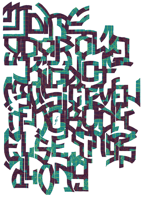
This
design is over barring and illegible making it hard to understand what
it says. The composition is unorganised and confusing and although the
type also works as an image the message it is trying to communicate is
not clarified. The effect on top on the colour makes it look tacky and
doesn’t flow consistently.
Type and image designs.

Source
The
image is sharp, crisp and interesting it also creates an optical
illusion of the characters doing different sex positions and is an
innovative design. The overall design is clear and the colour choices
are simple but as suitable for the genre of the book as blue and white
could connote the different genders. The type is simple and clear and
the composition of the writing fits within the image creating fluidity.

The
magazine is poorly executed through the use of multiple typefaces that
don’t fit within it’s context and looks cheap. The gradient background
makes it look unprofessional compared to other editorials and makes the
subject look like she’s floating. The logo also look dated and
unprofessional, the square around the text and the composition of it is
visually displeasing. Also there is a use of product placement that is
super imposed into the subjects hand and the editing of it looks obvious
and not smooth.
Image designs.
 |
| Source |
The
illustration is exploding with detail and intricacy, with different
designs and objects which make it look interesting. There is a simple
and chic black and white colour scheme which is the associated colours
of a skull. The execution of the illustration is clean and could have be
render using Photoshop giving it a professional and crisp edge.
 |
| Source
This
image has a lot going on with no clear relevancy or message, there is a
use of different multimedia, textures and colours that flow well
together and overall looks untidy. The design is confusing and holds to
clear message or identifies what it is. The approach to the design looks
rushed as the alignment of the objects are not symmetrical or don’t
work abstractly.
|
No comments:
Post a Comment