For our brief we have to create a full alphabetic typeface including glyphs that represents our allocated partners, through their likes, dislikes, characteristics, aesthetics and personality. With the current research and understanding of the anatomy of typographic forms I would have to focus on the manipulation of existing letter forms in order to create the typeface.
My partner was Jasper Lee and from the questionnaire I found out this.
With Jasper being tall I thought I could experiment with a range of letter lengths and line qualities to portray this. He also described himself as being confident and an out going character so I also wanted to keep the letter forms upper case, strong and bold to show this so I decided to research some 3D style typography.
After reading 'The 3D type book' by FL@33 I came across a lot of designs that I thought could be affective and sparked a lot of ideas.
One of the first artists I came across was Marian Bantjes and her piece "We're Sorry, 2009" the work was an illustration for The Walrus magazine and landed the front cover. The image was a mixture of 2D and 3D letter forms created with pencil crayons.
I liked the concept of the words and thought they could connect to Jasper's interests e.g his favourite meal is spaghetti carbonara. Also the font would give me a chance to experiment with long strokes and line qualities which tie in with his height.
I also saw another image that experimented with lines which was founded by Valentin Abad, Julien Dhivert and Sebastain Riverson. The image was created for an art exhibiton held at Paris'Galerue des Galeries.
I really like the concept and depth of the lettering and how it has been laid out. The line qualities are also interesting.
I also then came across a typography by Axel Peemoeller for Fled magazine. I really like his bold textures and how they are authoritative and strong.
The height of the letters would work well with the concept of experimenting with line lengths, depth and the textures of the lettering also would work well with Jasper's violent side.
I looked at designers Phil Robson and Mat Carlot, I really liked their comic book typography style and signature patters within the words and wanted to create something similar either for the whole typeface of name badge.
The type is young, playful and the structure is confident which also matches Jasper's characteristics.
I also read a book called "Typo Fuente de Inspiration" by Fabiola Reyes and came across a designer called Zarautz Bold. I liked one his designs that he created for Ochoy Media and wanted to incorporate the 3D lines into the name badge of full typeface.
I really liked the concept of Phil Robson and Mat Carlots work so I decided to do some more research on comic book style typography. I could experiment with exaggerated letter form lengths to portray Jasper's physical aesthetics. Experiment with 3D shapes to express his characteristics e.g confident, funny and violent and also incorporate a collage design within the 3D shape that embodies his likes, dislikes and information about him.
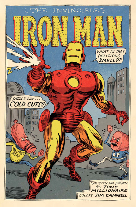
This is a vintage Issue of Iron man drawn by Jim Campbell, I really like how the typography is in the style of metal to fit in with the characters name "Iron man" with small screws placed around the edges and I think it incorporates the physical elements of the character effectively. I also liked how it sticks to a two tone colour scheme that also fits in with the characters costume. The letters are bold and strong which shows the traits of the superhero.
This is a vintage issue of The Rampaging Hulk, I like how the character is positioned as if he is holding the text and the angle at which he is drawn makes him look superior and adds authority. The colours look like they have been hand painted with oils and it gives of a old time style.
After reading 'The 3D type book' by FL@33 I came across a lot of designs that I thought could be affective and sparked a lot of ideas.
One of the first artists I came across was Marian Bantjes and her piece "We're Sorry, 2009" the work was an illustration for The Walrus magazine and landed the front cover. The image was a mixture of 2D and 3D letter forms created with pencil crayons.
I liked the concept of the words and thought they could connect to Jasper's interests e.g his favourite meal is spaghetti carbonara. Also the font would give me a chance to experiment with long strokes and line qualities which tie in with his height.
I also saw another image that experimented with lines which was founded by Valentin Abad, Julien Dhivert and Sebastain Riverson. The image was created for an art exhibiton held at Paris'Galerue des Galeries.
I also then came across a typography by Axel Peemoeller for Fled magazine. I really like his bold textures and how they are authoritative and strong.
The height of the letters would work well with the concept of experimenting with line lengths, depth and the textures of the lettering also would work well with Jasper's violent side.
I looked at designers Phil Robson and Mat Carlot, I really liked their comic book typography style and signature patters within the words and wanted to create something similar either for the whole typeface of name badge.
The type is young, playful and the structure is confident which also matches Jasper's characteristics.
I also read a book called "Typo Fuente de Inspiration" by Fabiola Reyes and came across a designer called Zarautz Bold. I liked one his designs that he created for Ochoy Media and wanted to incorporate the 3D lines into the name badge of full typeface.
I really liked the concept of Phil Robson and Mat Carlots work so I decided to do some more research on comic book style typography. I could experiment with exaggerated letter form lengths to portray Jasper's physical aesthetics. Experiment with 3D shapes to express his characteristics e.g confident, funny and violent and also incorporate a collage design within the 3D shape that embodies his likes, dislikes and information about him.
Comic book front covers
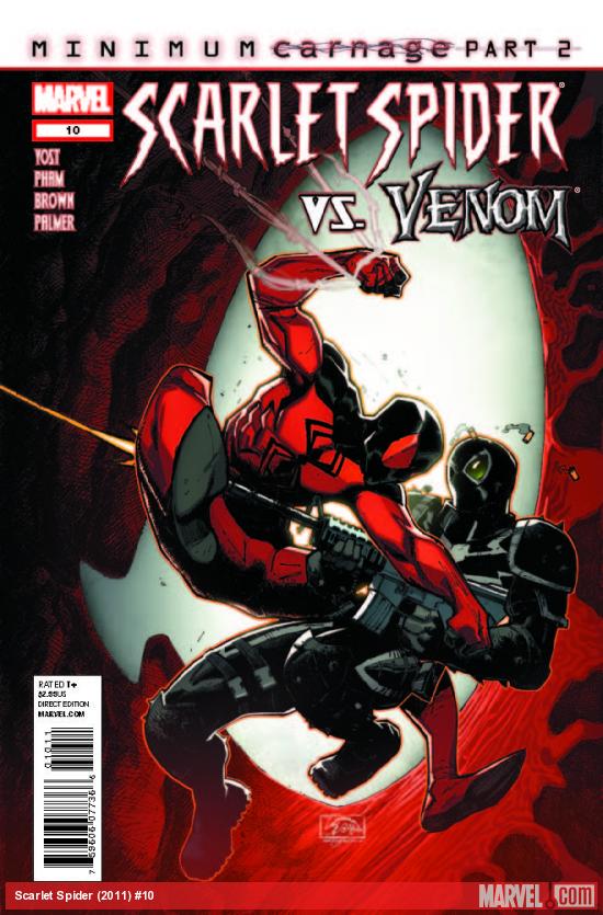
I decided to research printed comic books and franchises. I looked at the modern Marvel comics and vintage retro issues to gain inspiration for letter form styles to textures and colours which I could incorporate in my design.
This is a vintage Issue of Iron man drawn by Jim Campbell, I really like how the typography is in the style of metal to fit in with the characters name "Iron man" with small screws placed around the edges and I think it incorporates the physical elements of the character effectively. I also liked how it sticks to a two tone colour scheme that also fits in with the characters costume. The letters are bold and strong which shows the traits of the superhero.
 |
| Source |
This is a Vintage issue of Superman, I really like how the typography is at an angle of large to small as it adds depth to the letters and makes it stand out. The 4 tone colour scheme of red, white, blue and yellow also works well as it doesn't look to busy or over crowded and gives off a patriotic context.
 |
| Source |
 |
| Source |
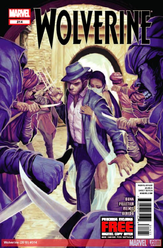
This is a 2010 issue of Wolverine, unlike the other comics the character isn't wearing a super heroes costume and sets the character apart from the rest. I chose this front cover as I really loved the overall purples hue that the magazine gave off and looked really original.
 |
| Source |
The comic books have running themes of superhero signature colour schemes and strong bold fonts to portray this. Looking at both vintage and recent comic books you can see the drastic difference in picture definition and quality and how techniques are used. I really like the vintage comic books as I feel they have nice old textures within them that I would like to experiment with and due to the project being hand drawn and not on the computer I think I could achieve this look more. The new edition of comic books look very polished and well rendered on the computer and if I was to create my typeface further either on Photoshop or Illustrator I would like to also experiment with those techniques.
Comic book products
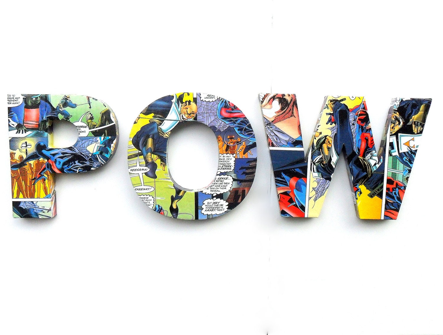
I came across this company that use vintage magazine pages to create individual letter forms that are bio degradable and eco friendly! I like how the comics cover the face of the letters in a comic strip style and the vintage tones to the images, creates a cool retro style.


I also came across this other company that creates them and I really like how they used images more than the text and the high contrast of the images makes them look glossy and brand new.
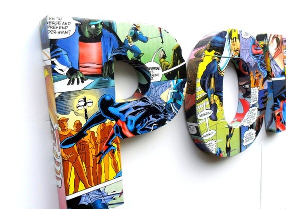
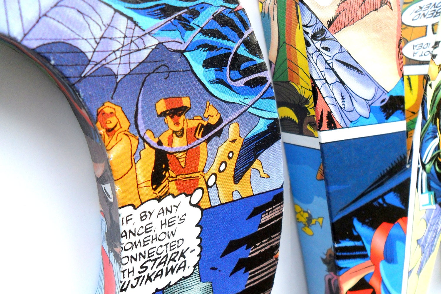
I also came across a popular clothing company called Black Milk. I was really inspired by how the designer James Ellis transfered his designs onto a range of materials and the success he gained from his signature comic book style. His business started off with no money into the production and is now a multi-million dollar company with over 160,000 fans.


A history of comic art
"comics, comix & graphic novels"
by Roger Sabin
For my research I wanted to look up more specialist resources so I rented a book on the history of comic book art. The book expanded my knowledge on how there are different genres, purposes, styles and techniques to creating a comic style piece of work, strip or art. This could help me figure of the pattern I wanted to incorporate into the typeface.
.JPG)

.JPG)
.JPG)


.JPG)
.JPG)
.JPG)


No comments:
Post a Comment