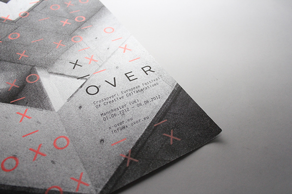
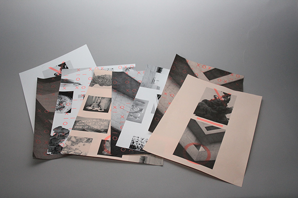
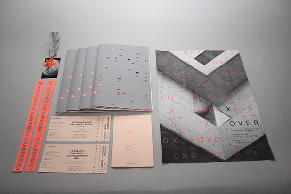
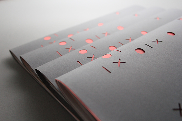
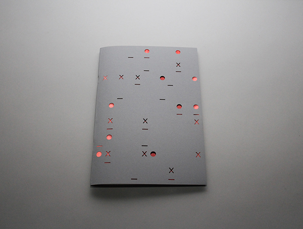
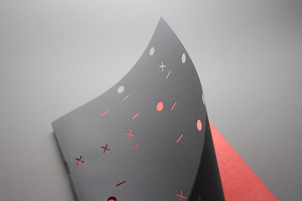
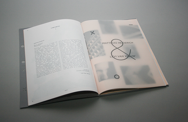
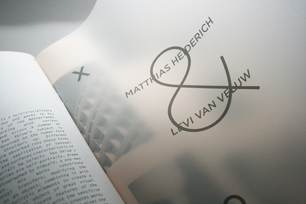
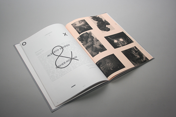
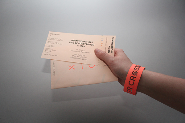
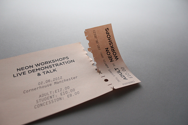
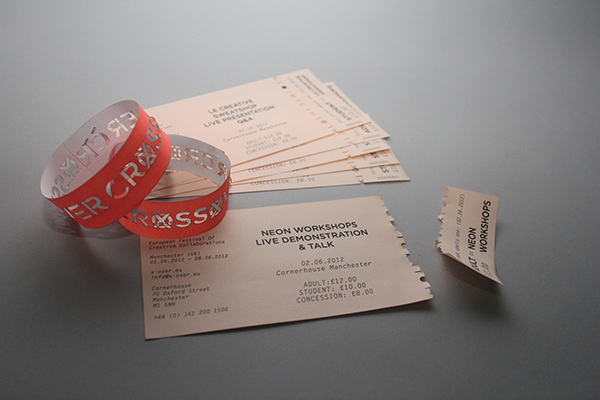
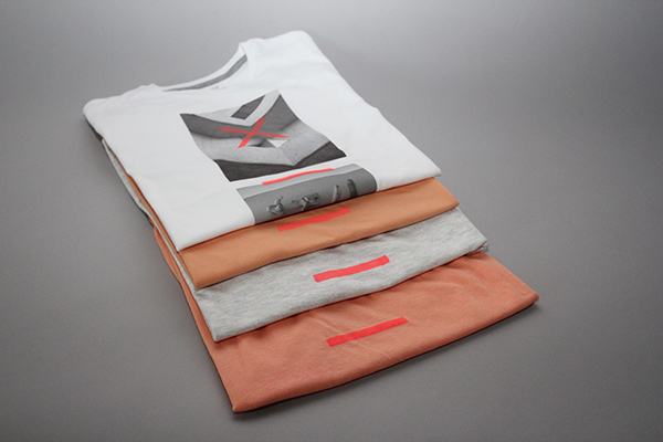
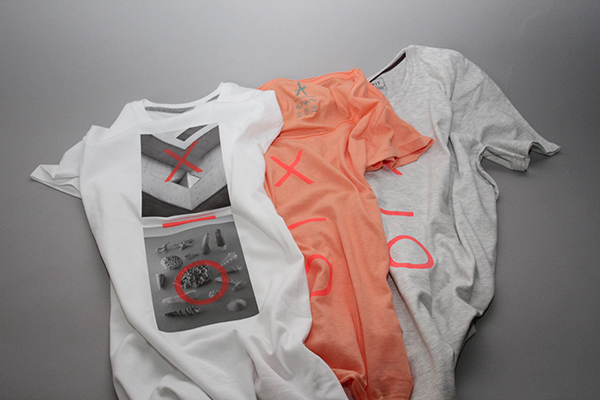
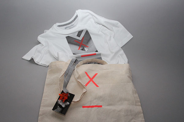
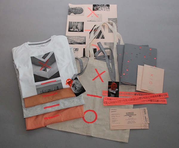
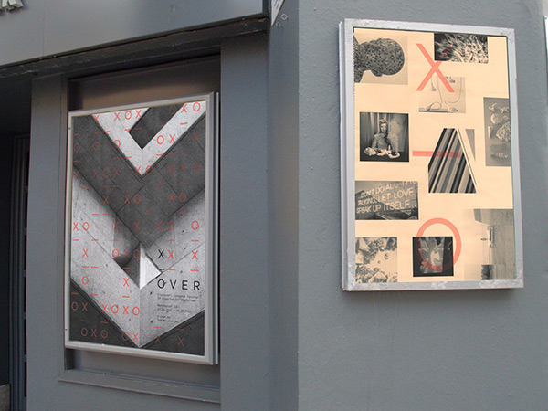
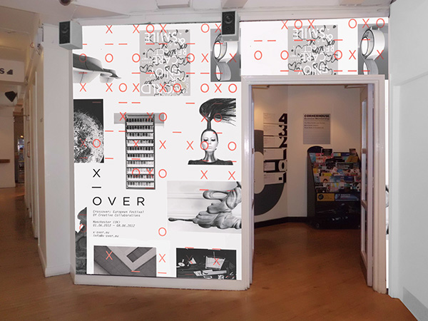
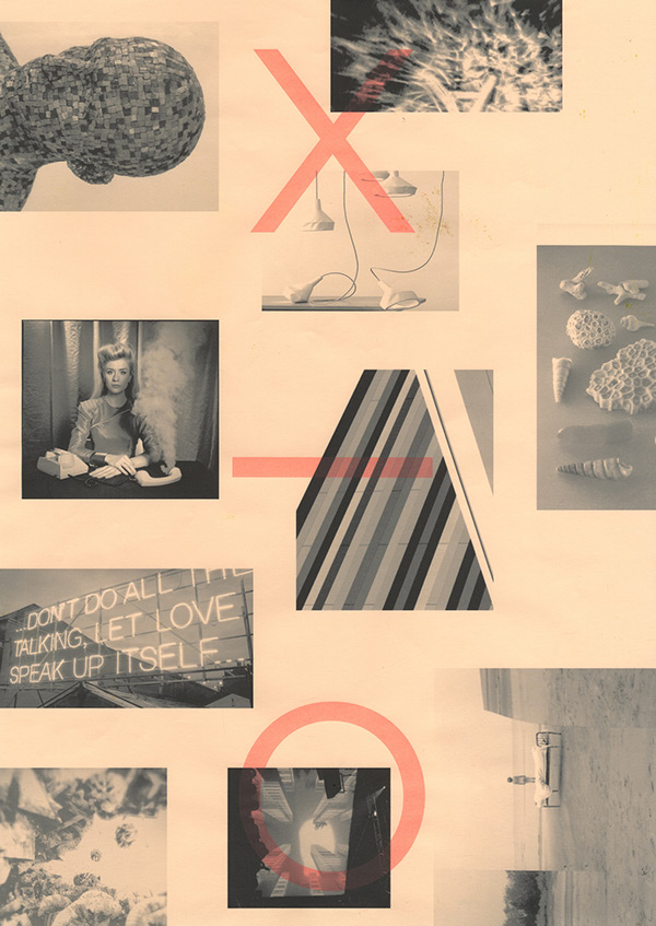
- A project developed in collaboration with Stephanie Oglesby to brand and promote a new festival aimed at creative professionals. We have proposed that the festival would entail inviting creative practitioners from various fields and disciplines to collaborate and 'crossover' to create a piece of work that they wouldn't normally. Thus, we named the project the 'Crossover Festival'. The name appears in various forms across the identity, with it being shortened to 'x-over' and then a pattern which adapts across the different resolutions. Black, white, grey and salmon form the core colour scheme with a screen-printed, neon spot colour overlaid. The printed collateral consists of promotional posters, a festival guide publication, event timetable, tickets, wristbands and lanyards. Finally, t-shirts and tote bags were also produced whilst we mocked up examples of the exhibition space.I really liked the design of this festival and the type against the images used, I deffintaltey want to incorporate photography into my work to enhance the atmosphere of the designs.
Showing posts with label OUGD505: STUDIO 2. Show all posts
Showing posts with label OUGD505: STUDIO 2. Show all posts
Thursday, 15 May 2014
FESTIVAL BRANDING: CROSS OVER FESTIVAL
Tuesday, 13 May 2014
FESTIVAL BRANDING: OFF FESTIVAL
- The OFF festival has been designed for an inter nation scale, I really like the way in which the logo is kept it's integrity but slightly changes for different areas.


- _____________________________________________________________________________________
Applications - Stationery


- T-Shirt & Bags

- Posters

- Signage

Thursday, 8 May 2014
FESTIVAL BRANDING: MAD MEN FESTIVAL
The mad men festival is a really creative and modern designed music festival branding design. I really like the use of colours they use throughout their branding and will be something I will consider in the development of my branding.
Mad Men

Mad Men
Wednesday, 7 May 2014
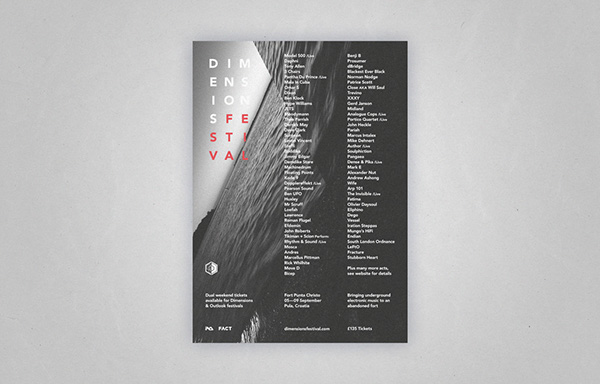
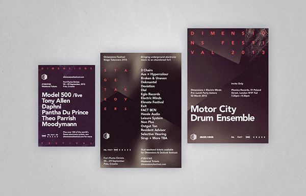
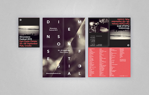
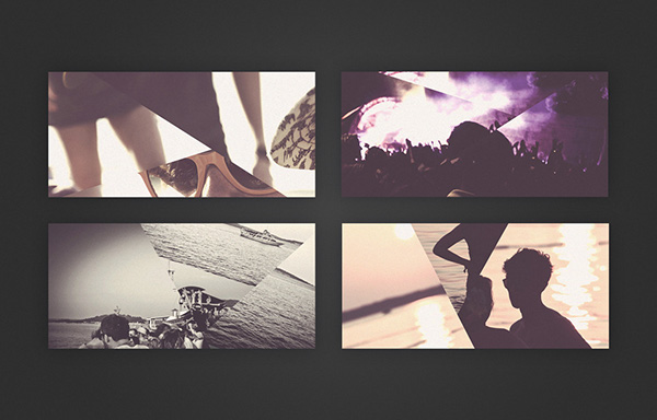
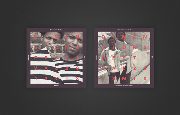
FESTIVAL BRANDING: DIMENSION FESTIVAL
- Dimensions Festival is an electronic music festival held in an abandoned fort in the Croatian town of Pula. Our remit covered design for billboards, posters, flyers, print and online advertising, plus branding for the Dimensions website and their various social media networks.The dimensions festival aesthetic is really modern and minimal, I really like the structure and layout of the type and image against the printed emphara.
Monday, 5 May 2014
FESTIVAL BRANDING: PRIMARY RESEARCH
A collection of primary festival items that I have collected as a source of reference for the production of my own.
Landyards


Wristbands

Poster Distribution


Landyards
Posters
Wristbands
Poster Distribution
Subscribe to:
Posts (Atom)