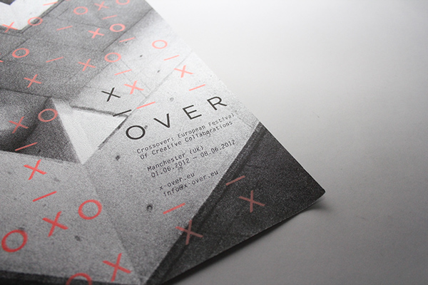
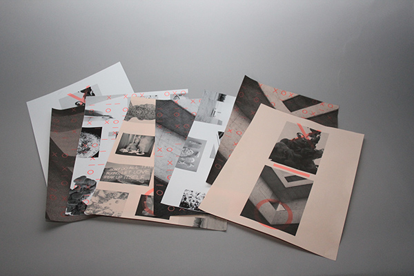
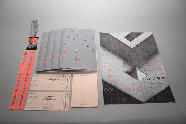
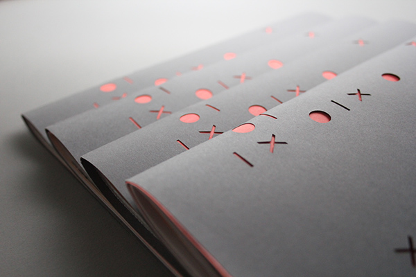
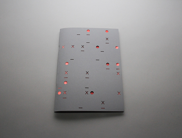
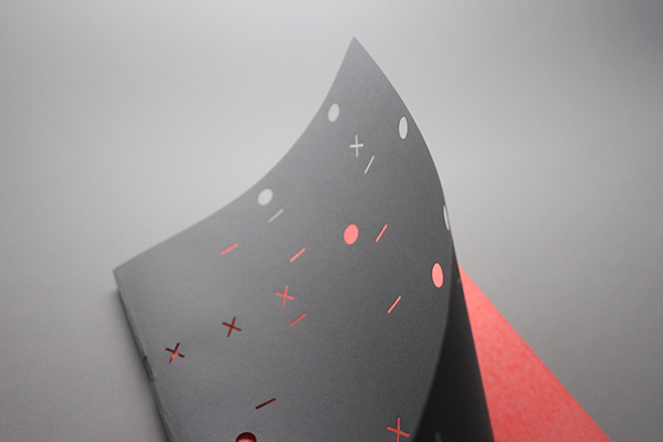
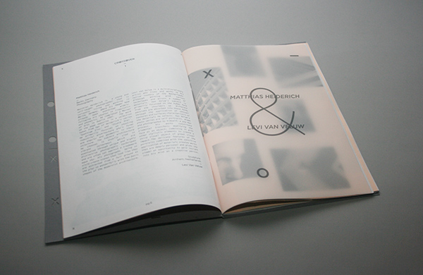
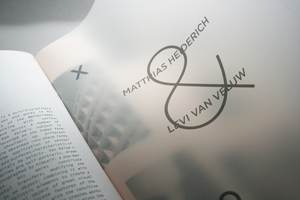
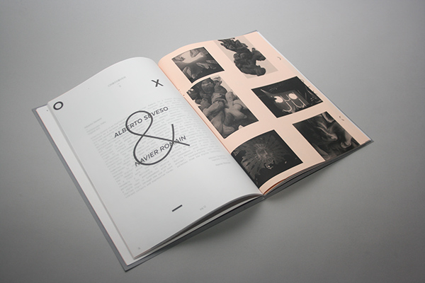
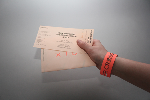
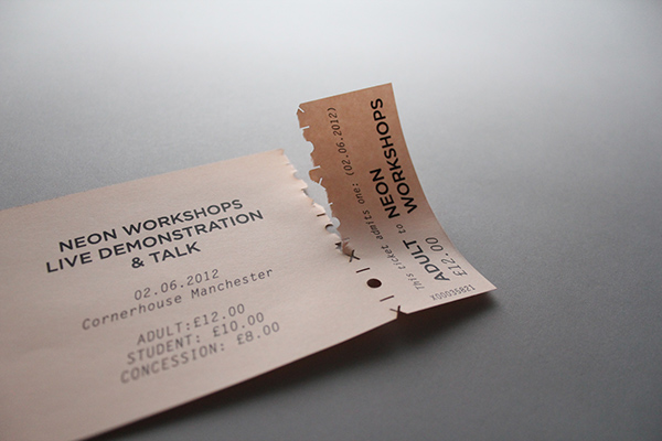
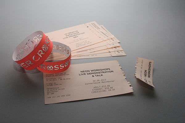
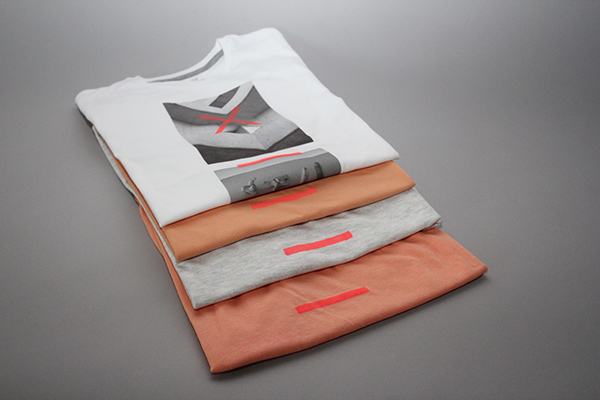
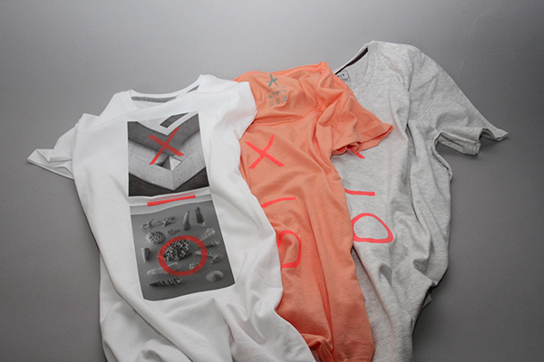
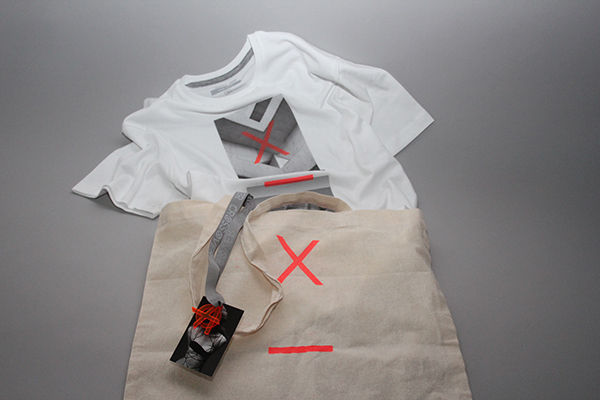
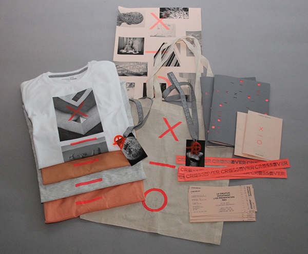
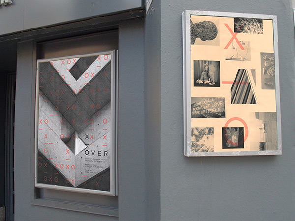
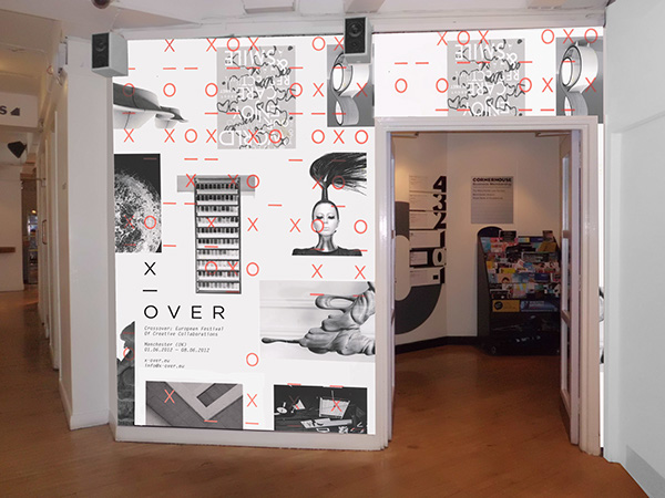
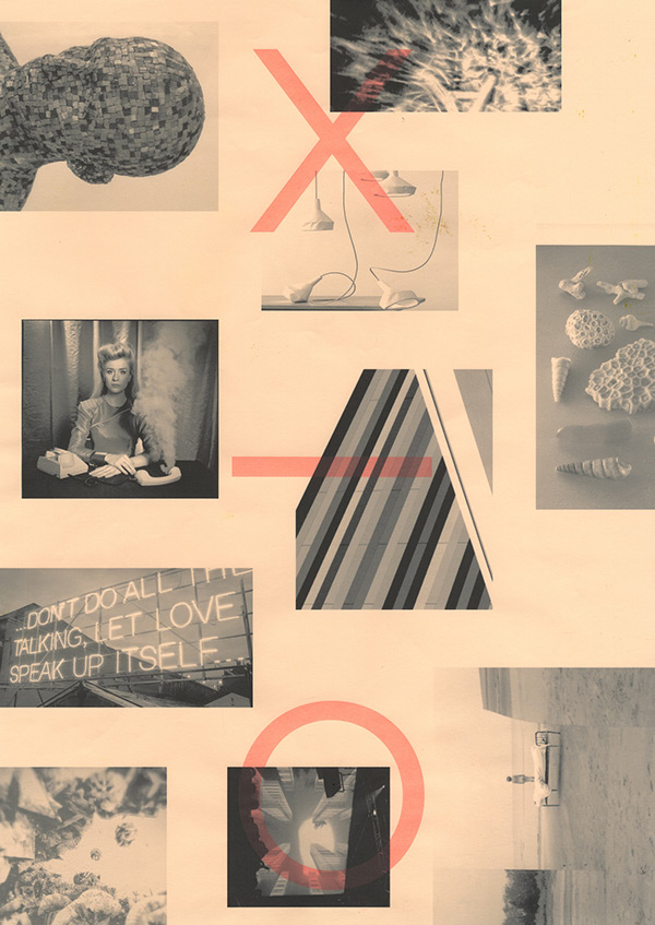
- A project developed in collaboration with Stephanie Oglesby to brand and promote a new festival aimed at creative professionals. We have proposed that the festival would entail inviting creative practitioners from various fields and disciplines to collaborate and 'crossover' to create a piece of work that they wouldn't normally. Thus, we named the project the 'Crossover Festival'. The name appears in various forms across the identity, with it being shortened to 'x-over' and then a pattern which adapts across the different resolutions. Black, white, grey and salmon form the core colour scheme with a screen-printed, neon spot colour overlaid. The printed collateral consists of promotional posters, a festival guide publication, event timetable, tickets, wristbands and lanyards. Finally, t-shirts and tote bags were also produced whilst we mocked up examples of the exhibition space.I really liked the design of this festival and the type against the images used, I deffintaltey want to incorporate photography into my work to enhance the atmosphere of the designs.
Thursday, 15 May 2014
FESTIVAL BRANDING: CROSS OVER FESTIVAL
Subscribe to:
Post Comments (Atom)
No comments:
Post a Comment