Considering the Oasis brief and the brands value I wanted to create something that will look similar to what the store has but with my input on it.
As a starting point I decided to look online at the Oasis logo and the fonts they use online.


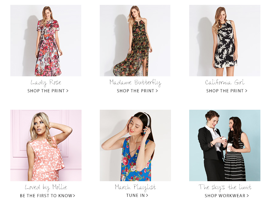

The company use a mixture of 1-3 fonts with bright colours and textures within or behind them. They also use a multitude of swirls and other feminine touches such as flowers.
From my research I decided to look into fonts I could potentially use for my design. I found that Oasis used a multitude of 3 font in their designs and wanted to find 3 strong ones that worked together that I could experiment with.
I looked at a range of font's on Behance, Lost type and Dafont. However I decided to experiment with these fonts initially to see which had the best outcome.
Block Font

Script


San Serif


I think these font are strong and are relevant to the Oasis style, but slightly different to give the company a new edge. Like I previously mention I wanted to create something that was inline with the Oasis brand but with a bit of my style also.
No comments:
Post a Comment