After reviewing the brief I began to look at lecture notes I had made.
A main topic of interest of mine was the Fashions as Photograph. I began to generate idea's through a brain storm, noting down some of my notes from lectures and things I was interested by.

.JPG)

.JPG)
REVIEWING THE BRIEF-
DEVELOPMENT CONSIDERATIONS
What do you want to say and how do you want to say it?
I want to show the divide between both mods and rockers in regards to the fashion and the influences of music, culture and society.
The tone of voice would be playful and nostalgic but keeping the design very true to the time era.
How will you translate your research into content?
I will translate my research into content through creating a picture book supported by a small introduction into each culture supported by quotes from song's and icons of the time.
What form or format will it take? Questions, answers, statements, quotes, images, photographs, drawings, diagrams etc. ?
The form of the book will main consist of statements, quotes and photographs.
Can you combine these elements ? If so....How? How will you organise the content? How will you make it interesting?
I would have a signifying image that represents a certain time or style in my book with text on the opposing side that sums up what that era or theme was about from icons of that decade.
CONTENT PROCESS-
To begin the production of the book I condensed all the information I collected into sections of what I wanted to book to consist of. I then condensed the facts I found into small statements.


I also condensed some of the quotes I found that were relevant to what I wanted to express also.


Doing this then helped me identify what specific images I needed to collect so it was relevant and would communicate what the era was about through the quotes from 60's icons and subcultures.
I ran into a lot of problems when trying to collect images either from then being so old that the quality wasn't great or there was copyright restrictions due to the photographers rights. This then took me longer that I anticipated but I collected them from a range of sources.
through researching for these images I found a lot of images that were either not relevant or their resolution wasn't high enough for print. This then prompted me to create a blog that would work alongside with the book as an online archive of all of the images from that era.
I called the blog 'about my generation' because its a 'The Who' song and also reffers to the 1960's generation of both subcultures.
- A few screen shots from archive pages.


Blog: About My Generation
DESIGN PROCESS-
To make sure that the design was synthesised with the content I then started creating page layout thumbnails.

These thumbnails were mock ups for the culture differences between the mods and rockers. I wanted the design to be very simplistic as the main factor on the page will be the photo and then the juxtaposing text.

I then experimented with fashion side of the layout, due to there being so many fashion statements such as the parka, the trilby and the hush puppies I wanted to create a magazine style cut out of the iconic garments.

For the music side of the book, the music of that era was a big influence in the overall fashion of the book. I wanted to create a envelope with the top track of that era for each subculture followed by old concert tickets and quotes in the style of a memorabilia page. I was influenced towards this design from the primary research I did at the vinyl exchange.

Finally for the battle of the beaches page I wanted to create a newspaper article style page using antique paper or newsprint so it would look like it was from that era. I looked at old newspapers from that era and drew some designs in the style of them.
From my selected thumbnail I then started to produce some mock-up designs to see how they would look aesthetically.
Mods + Lambretta's -


Rockers + Fashion -

Mod Female Fashion -


I experimented with colour and the images until I created something that I represented what I intended in my intial ideas.
I then created presentation boards of what the design was going to consist of for the progress presentation.

Book:
I
thought a coffee table book style would be most appropriate for my publication
because it displays a lot of images specfically fashion and cult related topics. My
influence for this style was Bill Harry’s
The 60’s that I read for primary research.
Pages:
The
pages in my book would have a picture on one side and the a quote / statement
on the other side.
Format:
I
chose to have a square shape book because it’s
not conventional like the people in my book. I also thought the images would
sit nicely round this shape boarder like a Polaroid.

Stock + Binding:
For
my stock I initially wanted to use red and black card to show the juxtaposing
pages. However when printing the black and white images the white areas would
turn to the colour of the stock. I then had to reconsider what other stock I
could use which would either be white card and a digital red / black background
or photo paper.
I
will be using newsprint for the centre of the book because of the newspaper
reports about the mods and I though this stock would be
relevant.
Hard cover using a case bound and board.
I’m
going to use a the perfect bind method to hold my book together using an online
tutorial I found.
Colour:
The
colour scheme for my book was inspired by the logo’s
the subcultures wore.
Mod’s
used the British army target logo which was red, blue and white. I chose red
because it’s bold and works well with black.
Rockers
wore all black and their logo was the ace of spades.
The
white would act as a balance between the strong colours through stock and some
type.
Font:
Due
to the book a comparison between both subcultures I wanted their to be defining
fonts for them.
The
influence behind the fonts was behind
the research I had done. Books about mod’s
would use a san serif type and books about rockers would use a serif type.
Print:
The
book will printed digitally with some possible embossing on the front cover.
I then presented these idea's from research in a crit format in front of Richard and my peers. I also received some further feedback from Fred.

I reviewed this information to see where I could go next and created a plan of where I could go next. I think my intentions for the book were very elaborate and I had to condense my concept so it was clear and more effective.
I decided to create a book just focusing on mod fashion and culture from the 60's to today by comparing the similarities through similar styles, images, music and quotes. I decided to include events that shaped the mod culture such as the battle of the beaches to show how the british culture affected the subculture.


I also decided to downsize the shape of the book to a 15x15 cm. I made this conscious design decision because when mocking up a new design for my book the packaging I wanted the book to go into would look most effective smaller.


I then started the design of my book following the same format of the thumbnails I drew previously.


I decided to create a book just focusing on mod fashion and culture from the 60's to today by comparing the similarities through similar styles, images, music and quotes. I decided to include events that shaped the mod culture such as the battle of the beaches to show how the british culture affected the subculture.
I then started creating more thumbnail ideas of how the layout the book could be.

I really liked the idea of a book sleeve that would highlight the mod logo.
Through my research on coffe table style books a reccuring theme was the use of book sleeves. I wanted there to be a strong significance towards the Mod logo which is the RAF sign. So I thought I could create a laser cut packaging box that when the book slotted in the target could be seen through it.

I hand drew a template design of how big I wanted the case to be.

I then cut out the template and made sure that all the sides were even.

Next I folded the tabs read to be glued together.
I also decided to downsize the shape of the book to a 15x15 cm. I made this conscious design decision because when mocking up a new design for my book the packaging I wanted the book to go into would look most effective smaller.


I then experimented with this further by using black stock and again made the box by hand.


The result of the packaging didn't look very proffessional and the front cover intially would be very plain do I decided to scrap this idea's and work with photography and type instead.
I then started the design of my book following the same format of the thumbnails I drew previously.
FRONT COVER -

I chose this image as the front cover because it has the mod logo which is a signifier of the whole culture but it represented in a stylistic and fashion forward way.

I then added the title 'We are the Mods' as it's a refference from the infamous film quadrophenia and I thought it flowed well with the whole conept of my book. Although the text is dark on screen when printed it is visibly seen. I also added my name to the book to give it a professinal edge as i'm the author.
CONTENTS -

For the contents page I was influenced 'Mod a very British phenimenon' by Terry Rawlings. I thought that the use of iconic things from the mod culture in the form of a collage would work with the nostalgic element of my book and also would add some interesting things to the design on my book. The images used are both contextul and cultural.
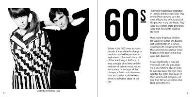
INTRO -
For the introduction page I was influenced by Patrick Frys 'Unordinary People' I liked how he used the 60's as a dominate feature on the page so I did the same and modelled my text around it. I chose an image of a mod couple so my audience could familairse themself with the style of both genders.
I experimented with different images, colours and images until I chose my final.


I chose this design as my final as it was in-sync with the rest of my publication and I think looked best with the image.
CONTENT PAGES -

For the first page of my book I wanted to introduce the audience into the lifestyle of the mod, looking at society of the time and the culture and these things shaped the subcultre. I used an image of a group of mods riding on lambrettas and a quote from 'The Who' to create synthesis.
For the next page I introduced the infamous Lambretta / Vespa the mods used to ride as this was a signifying thing in the mod culture.

I set out the page layout following my thumbnails as a guide and making sure the image had a ring of white space around it which is something I proposed in my initial ideas. I then started adding content.

Reviewing my feedback from a previous crit I then added the dates and times of when the images was taken and added the name of who I got the quote from.
For the next page I looked at mod male fashion.

I really wanted to use this image for my publication because it represented two sides of the mods fashion from the day-to-day to the nightlife style. However the image resolution was really low so I had to find another one.

Trying to find an image that was suitable and in a high resloution was really hard for this page so I used an outtake from the quadrophenia film instead. I again used another quotes from 'The Who' as it explained the characteristics of the mod culture in regards to their attitudes towards fashion.
For the next page I looked at female fashion.

From my mock up designs before the crit I didn't really have to change much appart from taking on some of the comments from my my crit. I changed the colour of red so it was the same as the mod target logo and change the alignment of the quote so it was the same as the other pages. I used twiggy was she was a 60's icon in the mod and fashion world.
For my next page I focused on music, this was a big signifier for the mod culture and many bands interpreted their style and characteristics.

I used a quote from Pete Townsend one of the band members from 'The Who' I really liked this quote because it summed up the feelings and emotions of that time in Britain and how music was the only route for escapism. I then paired it with a iconic image of the band looking very mod.
One of the biggest events in mod history was the battle of the beaches I wanted to include this page as it was something that created the demise of the mod culture from being a modest minor cult into a major cult.

I experimented with type initially but thought it took away from the image.

I decided to keep it plain and the book showed the divide between the mods and rockers of the time which was another thing in the mod culture that was significant.

I wanted the book the to be in the style of an old 1960's newpaper article as I was going to use antique paper to emphasis this. I thought thta by doing tis it would synthesis with the time era.


However I felt that it looked to squashed on just a double page spread so I went back to my thumbnails and decided to follow the same conventions as the other pages so the design would flow consistently.


BACK PAGE -

BACK COVER -

In between designing my book I thought I would practice the book binding method I had learnt from a tutorial to see if it would work and be effective with my book.

I took a set of leafs and aligned them ready to be folded.

I then folded the leaves into pages and put them into multiples of four. I then marked from the centre of the pages and moved outwards creating 1 inch marks. I then pierced holes through for the needle and thread to go through.

I then started sewing through the holes going back and forth through the holes until they were binded.

I then started to see that the paper started to crack on the sides and slightly in the centre.

However when I opened them the pages looked smooth, but were slightly unstable.
Whilst doing this I saw that the pages of the book were being damaged by the needle and because I wanted to use photo paper as stock I didn't want to risk the publication getting damaged.
I then researched into other ways of the perfect binding method. But due to time restraints I decided to get it done professionally at Hobbs.
This was quite a tedious thing to do as I was leaving my work in someone elses hands and it cost me a lot of money, which I didn't really have to spend. Also getting my book published by a company they didn't have the stock I intentionally wanted.
This then effectively changed my inital ideas for the design and the double page spread about the battle of the beaches which was going to act as a significant centre point for the book didn't stand out as they didnt have the antique paper stock.
BLOG UPDATE -
With the change of my publication I then had to change the style of my blog.


FINAL - a few shots of my final publication.


EVALUATION -
This then effectively changed my inital ideas for the design and the double page spread about the battle of the beaches which was going to act as a significant centre point for the book didn't stand out as they didnt have the antique paper stock.
BLOG UPDATE -
With the change of my publication I then had to change the style of my blog.

To begin the change of my blog I deleted the rockers links and just updated it to the mods page.
I then added a description to the blog so that visitors would know if they were on the right page and know what the blog was about.

I changed the header of the blog to mod target logo so it would synthesis this the culture and the book.

When the target is clicked on the links to the archive would appear for the visitors to go to.

I then changed the link colours so that they would synthesis with the mod logo.
I then started editing the archive page so it would flow consistently with the front page.

I changed the theme colours to the same as the home page.
I then started adding pages numbers so that the visitors could flick through the images like in my book.

Another page from the archive.
Although the blog was in early development when I made these changes I gain a few followers. I think making these minor changes to blog made it more successful. However I think I could have developed it more by adding images of my book and more links to other things about mods.
Blog: About My Generation
FINAL - a few shots of my final publication.


EVALUATION -
I found this brief really challenging with incorporating both theory into design and making sure the design was all relevant. I though I would try something different from what I usually do and I think by choosing a topic that I wasn't really familiar with and wasn't explicitly taught in the lectures was a risk.
There was a lot of problems when it came to me deciding upon what content should be in there and if it was relevant after having the crit. I was already set on an idea but I found these crits beneficial to the development of my book. I think I spent a lot of time contemplating on what I could include and slightly got lost in the research apposed to the design which is something I would steer away from in the next module.
I also thought that I didn't leave enough time for me to execute a lot of the design idea's I had. In order for me to avoid this I have to be more organised with the reality of my idea's and time of production.
I think a lot of my design decisions in the end were determined by time, cost and what would be ready in time for the deadline which is completely different from what I proposed in my inital idea's and thumbnails.
However I enjoyed the process of creating this book and finding out more about how a book is made and the different proccess and styles it takes to create them. I also liked how I created a digital element for the book aswell as it's relevant to this modern day and age which ties in with the 21st century section I finally added to my publication.
No comments:
Post a Comment