Analysing modernism and postmodernism graphic design.
I selected 5 pieces of modernist design and 5 pieces of postmodernist design and analysed why I liked them or not and if they worked. I found that there is a lot of changes between these era's of design and that graphic design has really evolved.
Modernism graphic design
 |
| Source
This is a painting that connotes a sense of social realism and is old fashioned due the materials used such as oil paints. The image marks a time in history and creates a sense of nostalgia of Russian revolution. There is a variety of colours used and is very intricate. I don't particularly like this design as I feel it's dated and doesn't look fresh or innovative.
|
 |
| Source |
 |
| Source
This is a poster created by Rodchenko, I really like the use of geometric shapes used and how the are positioned to created a boarder and emphasises the words coming out of the woman's mouth. There is a use of consistent primary colours that work well together and makes the design look contemporary to this day.
 Source
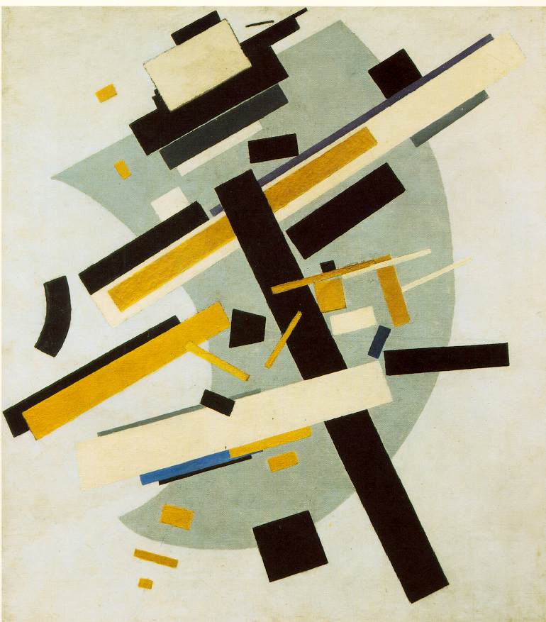
This is a design created by Malevich the poster uses a lot of geometric shapes and a simple colour scheme that stands out. I like the positioning of the shapes as it creates dimension to the image and gives off a modern abstract feel. It also looks very contemporary to this day.

This is a subway design created by the infamous Massimo Vignelli, I really like how he has made the complex simple by condensing the information down to colour codes and shapes. His design has effectively made the mundane interesting and used his design in a innovative way which is still used to this very day.
|
 |
| Source
This is a magazine design created by David Carson, I like the use of colours as they really stand out and are bold. However the text and images are a bit over crowed and miss leading. Some of the letters are arranged on the opposite sides of the pages and upside down which doesn't make sense. I think his theory of design is to create images with text but it makes the context unclear for it's audience.
 Source
This is a magazine called Dazed & Confused, I really like how the design experiments with type making it look fun, young and urban with a professional finish. The images bring anchorage to the theme of Britain and the colour scheme also supports this making it clear and identifiable.
 Source
This is a image by Andy Warhol who is famous for his pop art style, I like the way he uses bold colours to create an artistic look, although I feel the quality of the image is lost. However the colours he uses can change the tone and meaning of the image which I find interesting. Marilyn Monroe was a sex figure and classy, although in this images she looks cheap and tacky, creating another perspective.
 Source
This is a design by Barbara Kruger I like the concept behind her work as it connotes a sense of loosing yourself and not knowing who you are. I also like the vintage style she had and the use of collage techniques and layering to add definition.
 Source
This is a design by Jeff Koons, I don't like this work as I doesn't have any context or meaning behind it and I think the design is poorly executed as some of the images are not cut our properly with pieces missing . There is a lot of mixed media such as cartoons, paint splats, bra's and models that do not flow consistently and looks kitsch.
|
No comments:
Post a Comment