THE ANATOMY OF A BOOK
A book is a set of written, printed, illustrated, or blank sheets, made of ink, paper, parchment, or other materials, usually fastened together to hinge at one side.
A single sheet within a book is called a leaf, and each side of a leaf is called a page.
A set of text-filled or illustrated pages produced in electronic format is known as an electronic book (e-book).
Books may also refer to works of literature, or a main division of such a work. In library and information science, a book is called a monograph, to distinguish it from serial periodicals such as magazines, journals or newspapers.
PUBLICATION RESEARCH
For my publication I want to create a A4 square book. Due to me doing a comparison between both mods + rockers I wanted the book to have interational stock - eg. a card in the centre to represent the divide between both subcultures. I want the book to very clean and minimalistic due to the main body of content being image based. I also intent to use old 1960's images but with a modern day aesthetic.
I began researching publications that experimented with type, image and stock.
The first publication I looked at was Patrick Fry's 'Unordinary People' - Source


I really liked this particular page in the publication. I felt that it was an influencing way for me to display the images of the mods + rockers and also the quotes + lyrics that represented that time in a clean and aesthetically pleasing way.

I also thought the use of screen printing over the images, gave the publication an interesting texture, which is something I would consider.
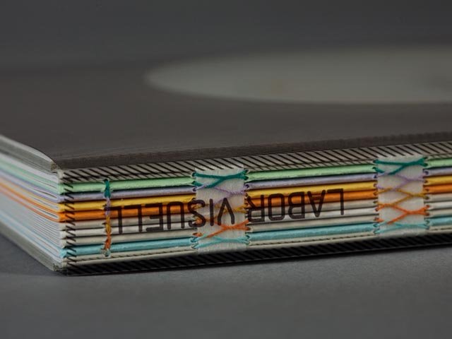
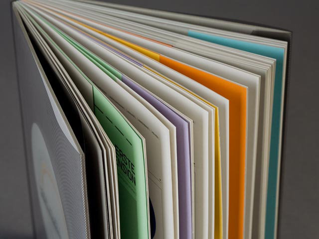
A double page spread by Heydays - Source

The use of juxtaposing colours on the spread really outlines the divide between the pages. Using contrasting colours or patterns would be a significant way to show the divide in my book.

This is another design by Heydays. The use of international stock between the pages also shows a significant divide.


Again this book uses colour and stock to show divides within the pages.
North and South divide by Craig Oldham - Source


This publication by Craig Oldham uses interaction stock to showcase the divide between North and South. I think the use of juxtaposing type on either side also exaggerates the divide which will be something I would like to incorporate.
After looking at these examples I then brainstormed some more idea's of how I could show the divide in the book. If I had a central didvide there might be some readability issues due to one side of the book having to be read backwards.
I then thought about other ways of using stock to show a divide and came up with the concept of using one colour for mods and another colour for rockers. The book would work as a double page spread comparison with the different colour highlight which subculture belong to a certain colour. This then lead me to start researching into books that experimented with this.
10 by Bunch Design - Source
This book uses different stocks for different sections of the content. I could possibly incorporate this style by having one colour for the influence of music and then a pull out concertina with the juxtaposing tastes of the mods and rockers.
Colour Plan by GF Smith - Source


Sirio Colour by Fred - Source


Source

A book by Dever Thomas - Source
The peep hole inside the book is a really innovative interactional feature. This would be something I would consider in the production of my book due to the amount of images I intend to use.
I then started to research into the format and style of book I wanted to do. I researched coffee table books as these styles work with a lot of images.
The book of dictators by Nicolo' Dante - Source
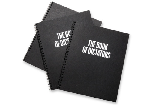
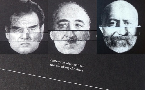
I really like how the book experiments with stock to create an image. The book is also ring binded which is quite easy to use and the minimalistic colour really stands out against the black stock.
Arvedon The Sixties - Source


Perfomance


Fashion 1944 - 2000

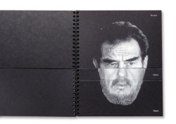
Portraits - Source *Screen shot more images*

I then came across Richard Avedon's Portrait book, The book has an image as the holder and inside is an accordion book of images that he has taken. I think composition of the book is very innovative and I would like create a book similar to this design.
A vocabulary of style by Chanel


Vershuka - Source *Screen shot more images*
The Polaroid Book - Source *Screen shot more images*
After looking at these style of books I had already generated an idea of how I intended my book to look. For more research I then decided to look into genre specific books that focused on my topic.
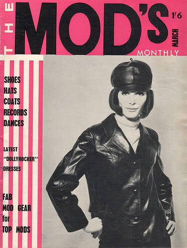
MOD STYLE BOOKS

Source: Mod Culture
Source: Mod Culture
The books use minimalist colour, bold font and black and white images.

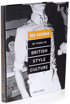
ROCKER STYLE BOOKS
Vanity Fair Spread

Source
BINDING
Similarly to the mod style books there is a use of minimalist colour, bold font and black and white images. The books also had the same type of binding this then lead me to research into this further.
To begin my research I looked into all the potential methods of binding.

Source
Out of all the methods I thought the perfect bind or concealed double loop would be the best for my book due to it being a coffee table style.
For primary research I looked at two book designs that I own that use this type of binding.
I found a photo album with a hard cover. The biding looked like it was supported by thick glue and a A3 page that stemmed across the book.
<image>
The second book was I scrap book I use to own, I really liked how the stock was supported by the ring binders but also how it was concealed by the big cover to make it look more professional.
<image>
Perfect bind.
A method of bookbinding were a flexible adhesive attaches a paper cover to the spine of the assembled signatures is called perfect binding. Perfect binding puts all the pages or signatures together, roughens and flattens the edge, then a flexible adhesive attaches the paper cover to the spine. Paperback novels are one example of perfect binding. A variation of traditional perfect binding is lay-flat or Eurobind binding where the cover is glued only to the sides of the spine so that a perfect bound book can lay flat when open. Also, some books may combine glue with sewn together signatures. - Source
After reading up about the perfect binding I wanted the book to lay flat and to take on a eurobinding method. This then prompted me to look into how it was made and what material were needed.
I found that in order to create this style of book it would take 3 separate tutorials for the binding method.
Concealed double loop.
A spiral binding method that is commonly used for creating documents, reports, presentations and proposals. This binding style is known by a number of names including spiral coil, colour coil, coluor coil, ez-coil, plastic coil, spiral binding, plastikoil and coil bind. Documents bound with helical coil (usually called spiral coil) can open flat on a desk or table and offer 360 degree rotation for easy note taking. This binding style is durable and is often used for documents that need to be mailed. Spiral coil binding spines are also available in more colours and sizes than other binding styles. - Source
After reading up about this method I found that this style was most prominent with documents and reports, which might affect the visual synthesis of the book. However due to the other tutorial being quite long I researched into how it could be made.
After looking at some tutorials I found that the method had have to a binding machine to create perfect alignment. I also considered the stock and how it might get damaged by the hole punching.
This then helped me decide that I would choose the perfect binding method for production.
Another feature in one of the books I looked at for primary research had envelopes were you could store things in. I thought this feature would be really interesting to hold a CD compilation of a few of the songs for that era. This then prompted me to look at CD holders and envelopes.
Due to time constraints for the project this will only be a consideration, if I have enough time left over.
FORMAT
Initially I wanted the format of my book to be in the shape of a square. I researched into the dimensions that I could use.
I think a 12x12 book would be big enough for my book as it can still hold high quality images however the images may not be the same dimension of the page. This is something I will have to research further into.
COLOUR
COLOUR
Considering cost and the amount of content I want to use. I will be printing in black and white. This also is due to the fact that most of the images I sourced were in black and white so it will keep consistency within the publication.
FONT
Mod Header
Rock Header :
Body Copy:


STOCK
Due to me printing in black and white I will use various stock to add colour. Reflecting back on my research mods signifying colours where red, blue and white due to the target that was reflected in The Who's logo. In comparison the Rockers used a lot of black and white due to their dress sense and the ace logo that was from the ace cafe which was a place they use to hang out.
Mods: red stock + white writing
Rockers: black stock + white writing {vice versa}.
I then researched into paper that coffee table books used.
- 200gsm silk paper
- Press Printed Paper – 200gsm satin paper for a real art book feel.
- Lay-Flat Paper – Press printed 250gsm matt paper.
- Photographic Paper – This is the heaviest paper in the range.
I then went to paper chase to have a look at the texture and price.
<images>
From my research I looked at the historical moment between the mods and rockers one of which was the May Day bank holiday Monday. There was a lot of news coverage about the day so this then prompted me to use this in the centre of the book as not only a divide but as a build up to the comparison between both cultures.
I want to use news print for this section of the book as I think it brings synthesis to the time and the context of what happened.
I then looked at 20 newspaper, also created by Patrick Fry - Source
The texture of the newsprint gives the publication an old school vibe which is relevant due to the time era i'm researching. I also like the relationship between type, image and printing as they all work harmoniously and still look relevant and modern.
PRINT METHOD
Considering time, cost and content I will be using the generic lazer print to make my book. In regards to the front cover I might emboss or lazer cut a design.
Considering time, cost and content I will be using the generic lazer print to make my book. In regards to the front cover I might emboss or lazer cut a design.
No comments:
Post a Comment