I was commissioned to choose 5 criteria's from the list that we made from the previous study session which where Layout, Colour, Composition, Communication, Concept, Legibility, Function, Audience, Quality of execution, Media & method,Visual content and Non visual content. I have to briefly summarize what will generally affect what I like and dislike when analyzing work, using the images used in the session.
The 5 criteria's I chose where quality of execution, colour, layout, concept and audience.

Quality of execution: The execution of the design is done effectively, making the image look smooth and intricate. There is no pixelations and the design is of a good resolution
Colour: The colours are kept to a minimal and flow together consistently
Layout: The layout is central and makes the image stand out amongst the grey space.
Concept: The concept is executed in an abstract way, and wouldn't necessarily be clear without an explanation
Audience: The audience is unclear, however I suspect it's for females due to the content and those enjoy abstract design.

Colour: The colours are simplistic yet striking due to the use of yellow.
Layout: The layout is central and bold making it stand out to it's audience
Concept: The concept is to advertise a building and DIY event which is signified through the use of images of tools and context.
Audience: The audience is aimed at people who work within the building trade or people who like to create and make things that include those materials. the colours are also non gender specific suggesting its for males and females.

Quality of execution: The quality of execution is over baring and unclean
Colour: There is a simple colour scheme which is also edited to create other tones such as purple and light blue within it.
Layout: The layout is all over the poster and there are elements of design in each section of the pages making it look busy and complex.
Concept: The concept behind the image is to promote a music event, which is made clear through some of the images and the writing, however there are also of elements of design such as swirls that are added to give more decoration, which makes it look tacky.
Audience: The audience is targeted at people who are into electronic music which is signified through the models style and the information on the poster.
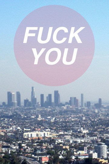
Quality of execution: The quality of execution is poorly done, as it has no consideration of composition and the image is pixelated and unclear.
Colour: There is a use of purple, pink and white colours that don't flow consistently with the image.
Layout: The layout of the text in circle is not concise as there is a lot of empty space at the bottom making it not even.
Concept: There is no clear message of the meaning and purpose of the image, and the photo is unidentifiable as there are no clear landmarks to suggest where it is. However the concept could possibly be saying "fuck you" to the city life in general as to one specific place.
Audience: The audience for this image is possibly directed at a teenage audience due to the language, however the context and concept are unclear which makes it hard to know who it's aimed at.
No comments:
Post a Comment